I just completed a fun call for testing for the (beta) Full Site Editor, the upcoming addition to the WordPress project that allows for customization of page elements that have traditionally been uneditable, such as the site title and menus. The Full Site Editor (name TBD) can be considered a continuation of the Gutenberg school of thought: it’s all blocks. Everything displayed on the front end is now something that’s customizable directly within the editor. So, an exciting change in WordPress core!
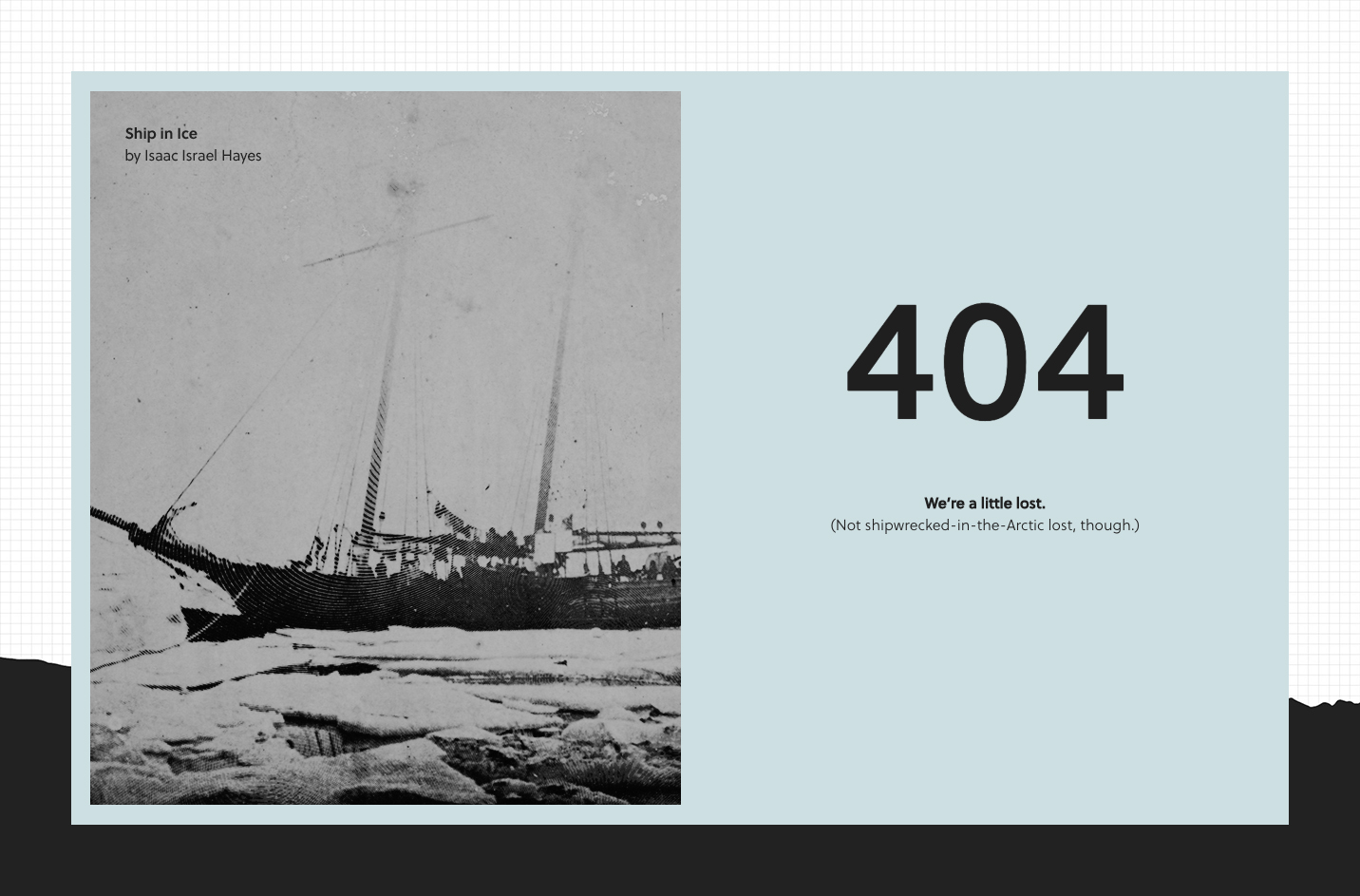
This most recent call was for testing the creation of a custom 404 page:

In terms of UI, the FSE navigation system is an fresh new take on a WPAdmin-like sidebar. This feels like a huge step towards bringing core navigation into the modern, block-editor era.
The questions below are from Anne McCarthy, who has been leading continued calls for testing as a part of the Full Site Editing Outreach Program. I also completed this testing exercise with special consideration towards accessibility features, and will be sharing my findings with the Accessibility Team in the dedicated Making WordPress Slack channel — all are welcome to join us on Fridays at 15:00 UTC to discuss!
Q. Did the saving experience make sense when making changes to the Template Part vs the general content?
As others have noted, the switch between editing a Template and a Template Part is subtle but there are current efforts underway on GitHub to introduce an isolated editing view that could help make more of a distinction between the two. The experience of editing a Template Part really does feel a bit like popping the hood, which is something a dramatic context shift could help emphasize even further. The concept of a context shift could eventually be applied to the experience of switching between editing regular content and a Template as well:
Q. What did you find particularly confusing or frustrating about the experience?
It seemed like you should be able to add a new Template Part in the same way that you can add a new Template, directly from the FSE sidebar. There are some interesting explorations around unifying the two within the navigation sidebar in this issue:
I lost track of the Settings sidebar a couple of times when I had been editing Global Styles because the advanced block controls that usually appear in the sidebar weren’t automatically shown when a block was selected. There was already an GitHub issue created for this bug, and I’ve added a comment there to note that we should consider how to best handle this behavior when the Global Styles sidebar is open:
My Wishlist
Fixed Position Headers and Footers
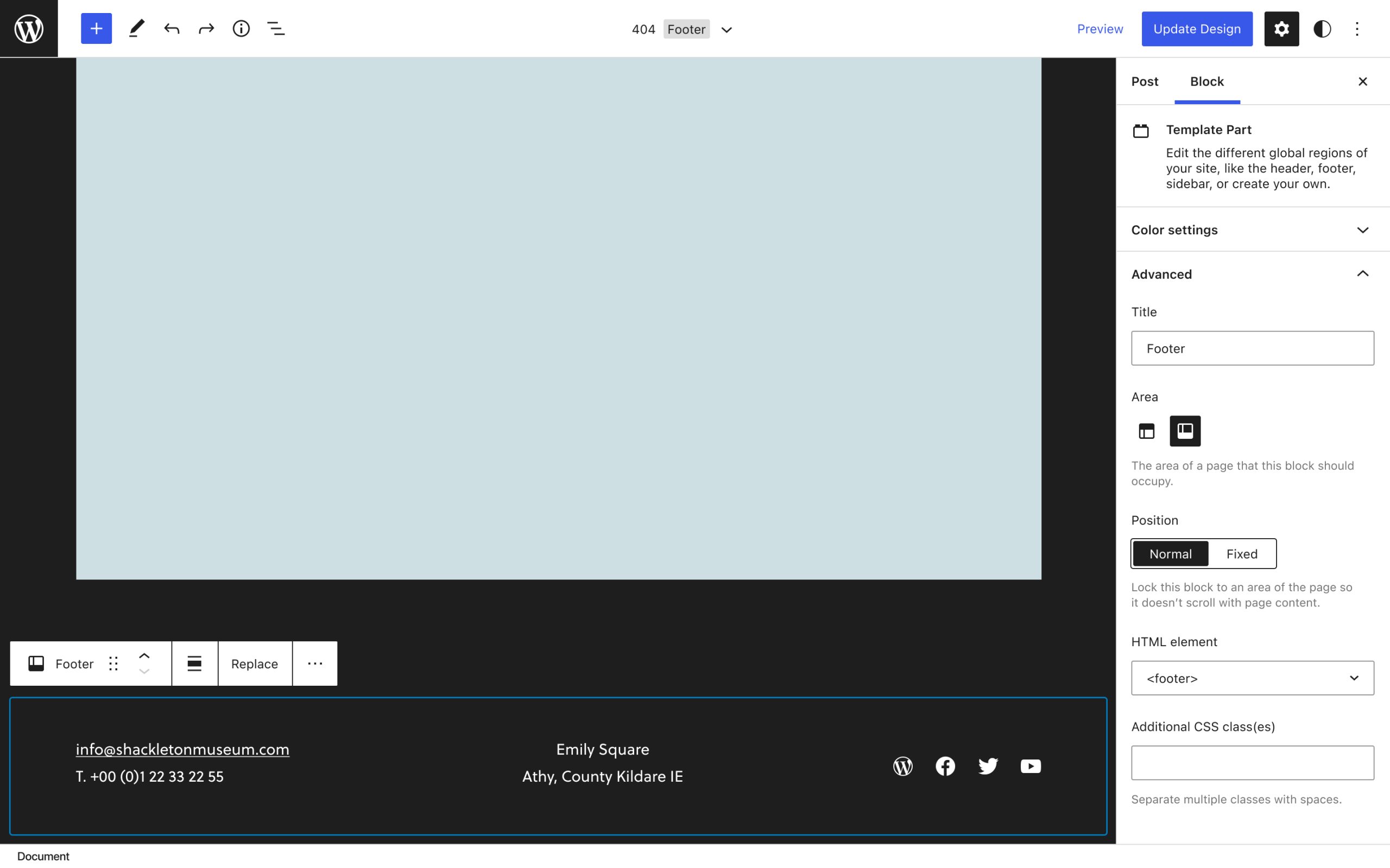
There has been a little talk already about adding background image support for Template Parts. This would likely include an option to set the background image in a fixed position, similar to the option currently available for the Cover block. However, I think it would be useful to extract this option from being specifically tied to background settings, and make it a more general option that’s available to Header and Footer Template Parts whether or not they have a background applied.

I opened a new issue on GitHub and proposed adding this option in the “Advanced” settings for the Template Part in the Block Inspector. There was a great suggestion that this toggle might be better located with other layout options within the Global Styles panel:
A way to input custom CSS
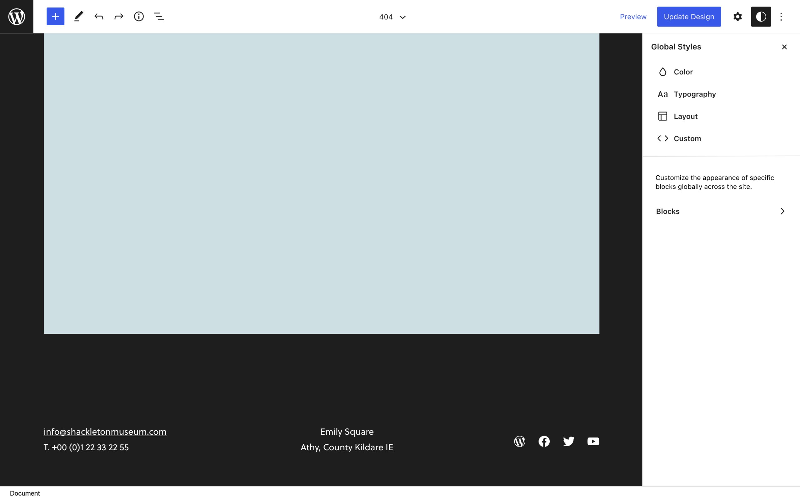
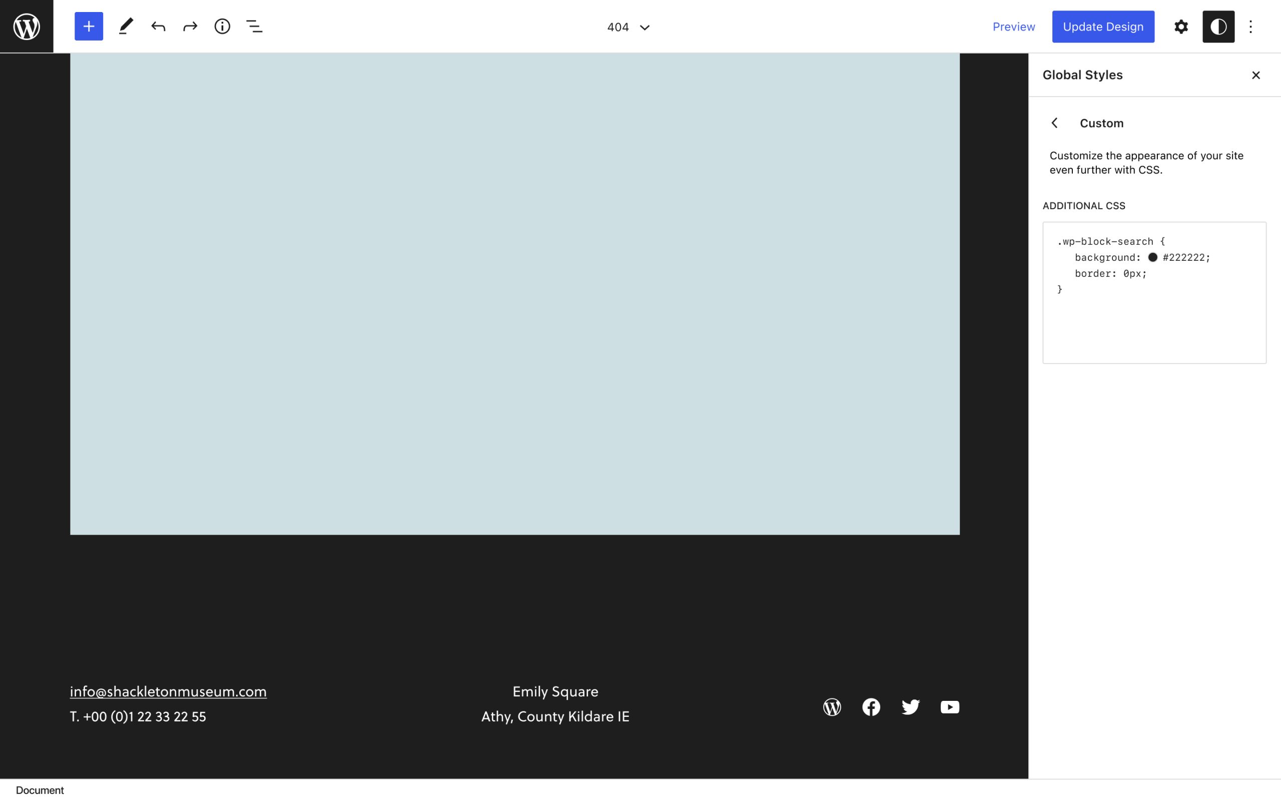
I wrote a post recently about user autonomy in the block editor, including an idea where the user could build out their own sidebar of custom controls. If I could customize my sidebars in the Full Site Editor, I would add a “custom CSS” widget to the Global Styles panel. I imagine that most of the things I added to my custom 404 page via the Customizer will eventually be handled by Global Styles, such as control over site/page background images. But as a designer, there’s always going to be something I want to tweak a bit further 🙃
I’ve opened a new issue here to discuss the possibility of an “additional CSS” input for Global Styles:
Accessibility Considerations
Keyboard Navigation
Keyboard navigation worked for the most part, however many of the keyboard shortcuts I would normally rely on aren’t currently incorporated into the FSE. It looks like most are still in the process of being added and are being tracked here:
Now that there are starting to be many possible configurations of toggled sidebar states with the addition of Full Site Editing, I can imagine wanting to revisit some keyboard shortcuts to make the open/closing behavior of all the sidebars possible through similar, easy-to-remember shortcuts. For example, each of the sidebars might be given some variation of the shortcut used for toggling List View open: ^⌥O.
Another keyboard shortcut request for the FSE that popped up on GitHub recently was a shortcut for saving changes, which would be helpful as it took me a couple of tries to reach the secondary Save confirmation via keyboard:
Screen Reader Use
I found elements within the FSE to be well-labeled and read out in an easy-to-follow sequence but I would defer to (and love to hear more from) users and contributors who rely on assistive technologies about the ease of navigating and creating with a screen reader.


3 responses to “Full Site Editor: 404 Test”
[…] completed a recent call for FSE testing and detailed the experience in a blog post. Feedback on FSE: Unified keyboard shortcuts for sidebars is also […]
[…] @critterverse for the lovely and comprehensive writeup of your experience testing including some accessibility feedback. […]
[…] 404 design […]