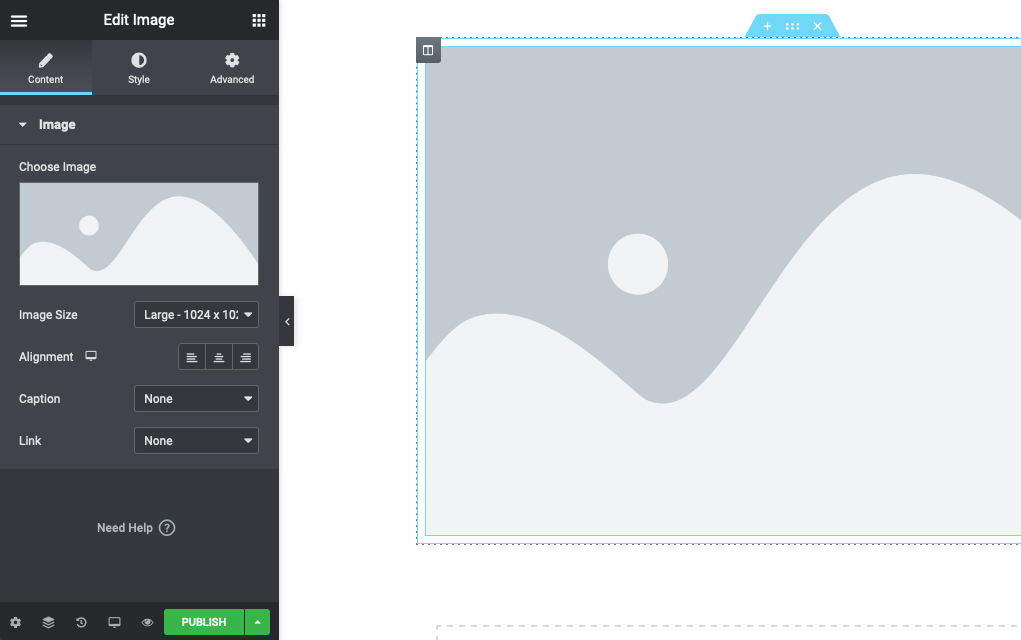
In the Gutenberg block editor, blocks have two sets of controls.
Block Toolbar
Block controls and settings that are considered primary functionality (critical to the block’s usage)
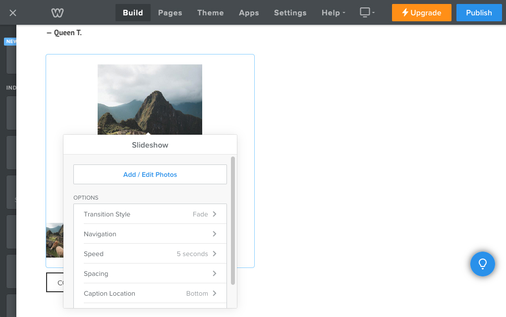
Block Inspector
Block controls and settings that are considered advanced functionality (nice-to-have on top of the core tools available in the block toolbar)
One pattern that has emerged in Gutenberg is that a condensed version of some tools may be available in the toolbar, while the full breadth of functionality is accessible from the inspector. A conversation about this tendency led me to the following observation:
As a newbie contributor to the WordPress project, my take is that it’s confusing to see the toolbar controls duplicated in the inspector. When this kind of duplication happens in design software, it’s typically because I intentionally opened a new set of more robust controls when needed (think windows in Photoshop or plugins in Figma). The same delineation between primary and secondary functionality already exists in Gutenberg but as a user, I don’t have to go hunting for and opening additional panels/windows/whatever, which is great. But it can also be confusing re: what the sidebar controls are, why some things are duplicated, etc.
Snippet of my conversation with a fellow WP contributor about block controls
These design software examples follow a similar pattern:
- Secondary controls are hidden by default
- The user has autonomy over whether secondary controls are opened or closed
- The user has autonomy over where the secondary controls are located and can move the window around as needed
- Controls are typically only open on an at-need basis and closed when they are no longer in use
I’m curious whether any of these concepts could be applied to the block editor to simplify usability by only showing controls when contextually relevant. This post is for tugging at that thread to see where it might lead!
Auditing website builders
I looked at the following website building tools that rely on a WYSIWYG editor similar to the block editor to see how they handle secondary-level controls:
- Wix
- Squarespace
- Elementor
- Weebly
- GoDaddy
Questions:
- Are secondary controls for selected elements on the page shown or hidden by default?
- Do the controls appear in close proximity to the element on the page, where they can be moved around by the user? Or are they located in a sidebar or another separate area of the editor?
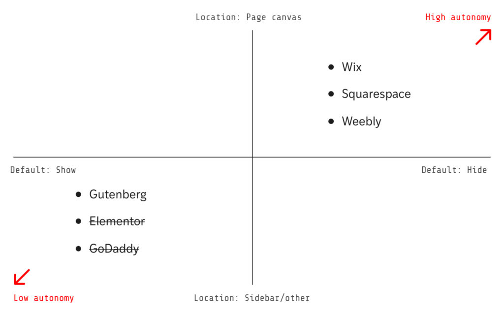
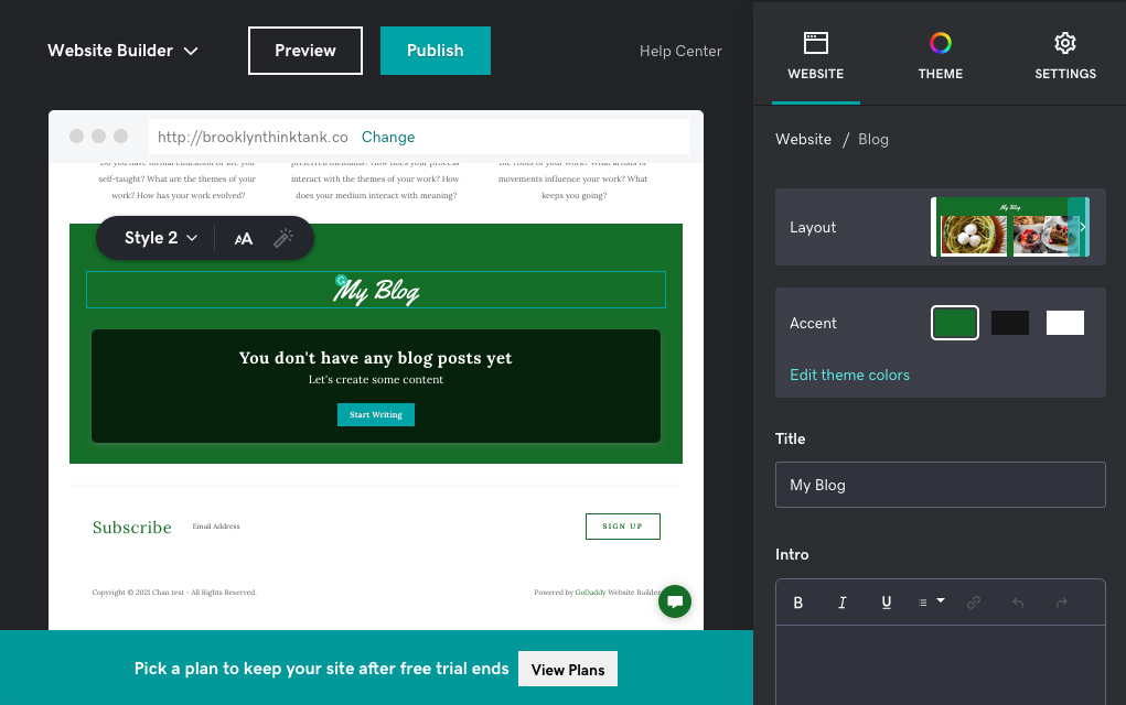
Elementor and GoDaddy aren’t the most useful examples because neither has a true separation of primary and secondary tools — pretty much all tools live in a sidebar (other than things like inline text controls):
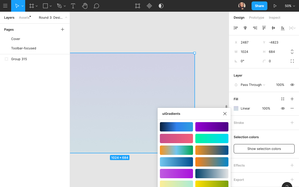
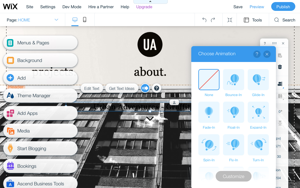
Wix, Squarespace, and Weebly handle secondary controls by following the pattern established in the design software examples. For the most part, advanced controls are hidden by default and when opened, they can be positioned by the user:
As a thought experiment, how could we apply these patterns to advanced controls in the block editor?
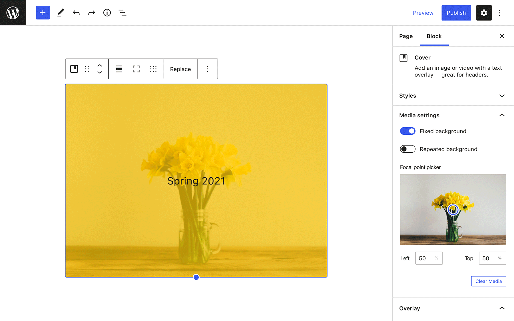
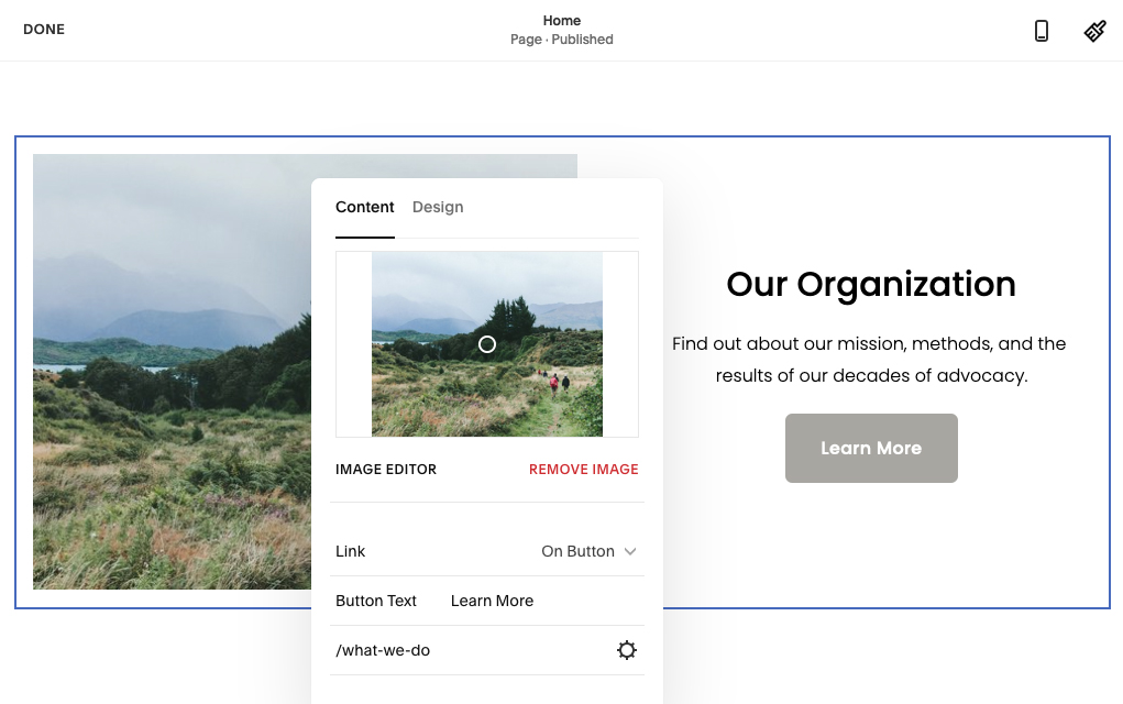
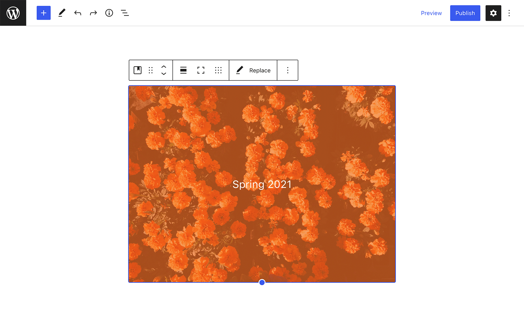
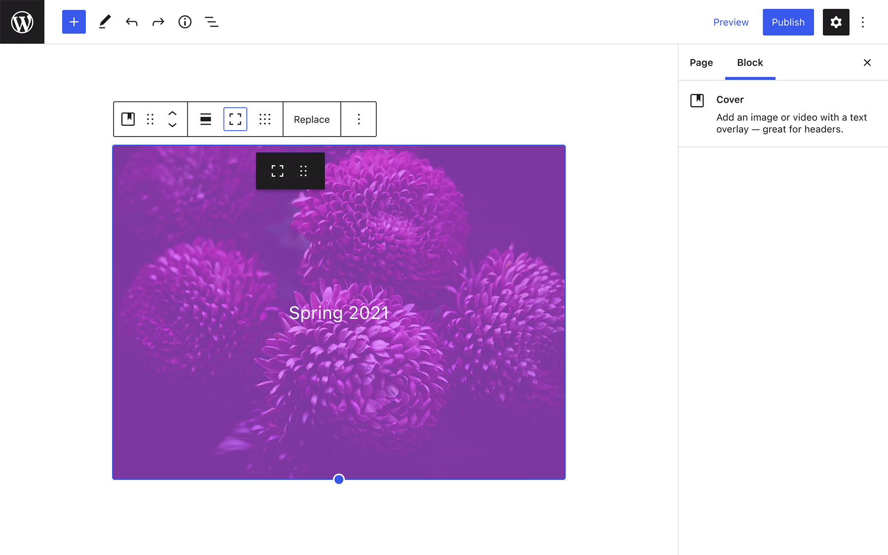
Using the Cover block as an example, here are a few ideas for increasing user autonomy over the visibility and location of secondary block controls, from small tweak → fundamental change:
Panels in the block inspector always default to closed
This is a small change that would allow the user to discover advanced controls on their own.
Advanced tools can be opened from the block toolbar
The additional controls could appear in the inspector, or as a floating menu close to the affected block.
Advanced tools can be arranged into a custom sidebar
Items from the toolbar could be dragged into the inspector to reveal advanced controls, allowing users to build their own sidebar as needed.
The ongoing Global Styles effort is a big change to the block editor that gives the user another layer of control over block options. What type of usability improvements would you like to see with these new controls?