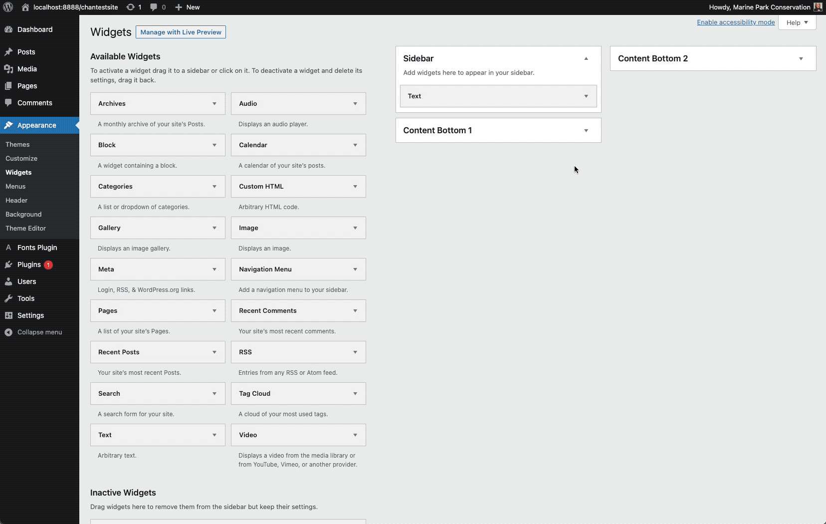
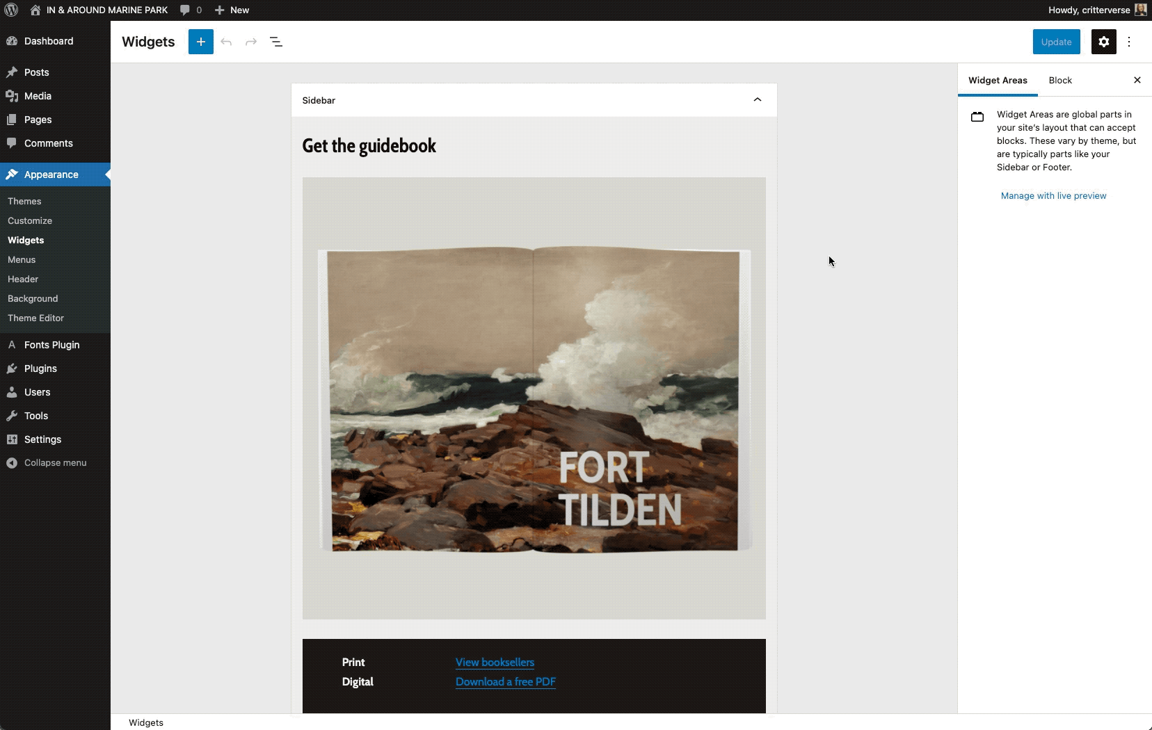
WordPress 5.8 (released last week 🎉) brings the power of Gutenberg blocks to widget areas — which means highly customizable layout and styling options, and a more WYSIWYG editing experience. I made a test site based on oldie-but-goodie Twenty Sixteen theme, which has 3 separate widget areas to work with. In this post, I’ll highlight a few cool things that are now possible to do with your widgets, and a take a look at where things may be heading next.
Create interesting visual effects with overlapping layouts and Duotone images
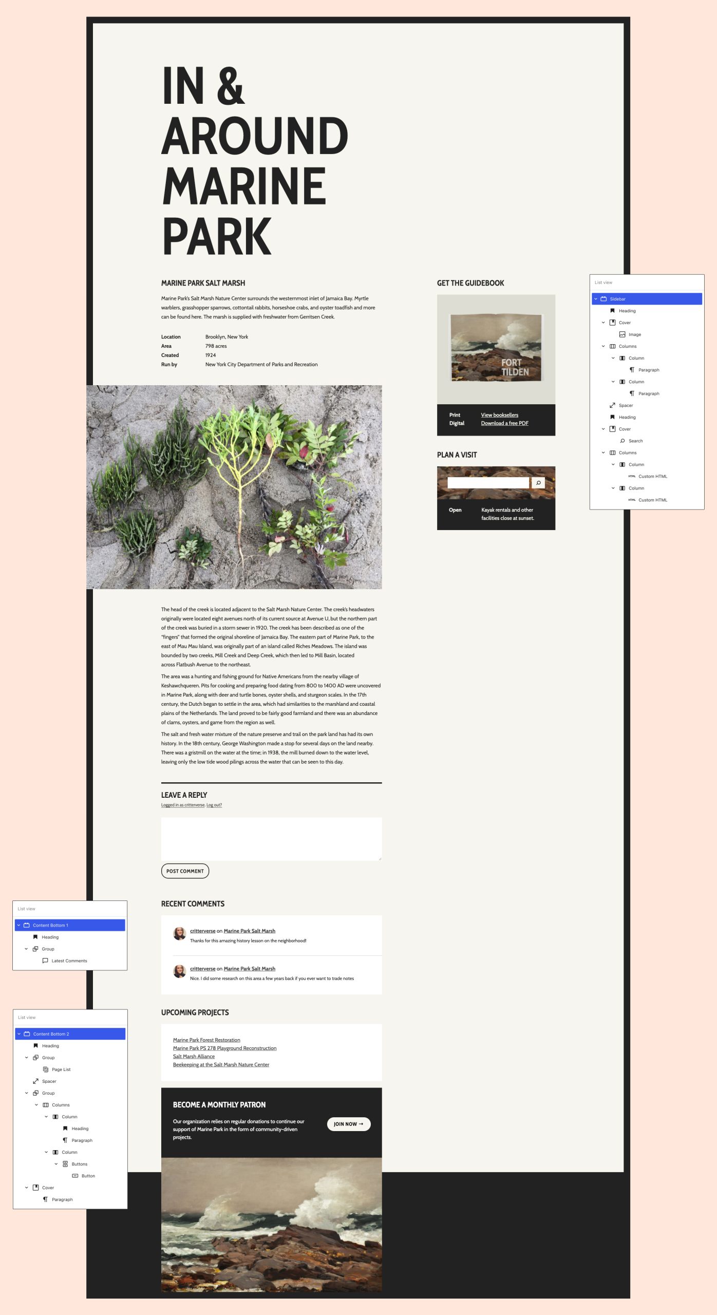
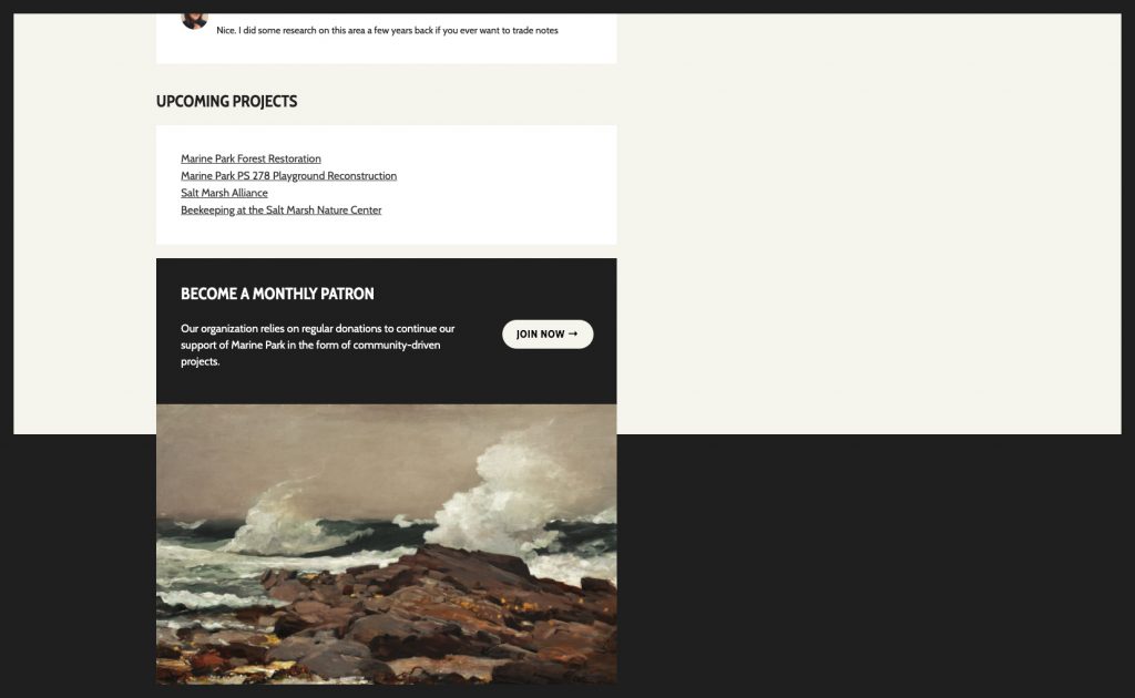
Appearance-wise, users have a lot more control over widgets areas than ever before — especially through the use of blocks with tons of customization options like the Cover and Image block. Here’s what I’m able to create in the classic widgets editor (left) versus what I’m able to create in the new block-based widget editor (right).
Intersperse widgets and custom code throughout your visual designs
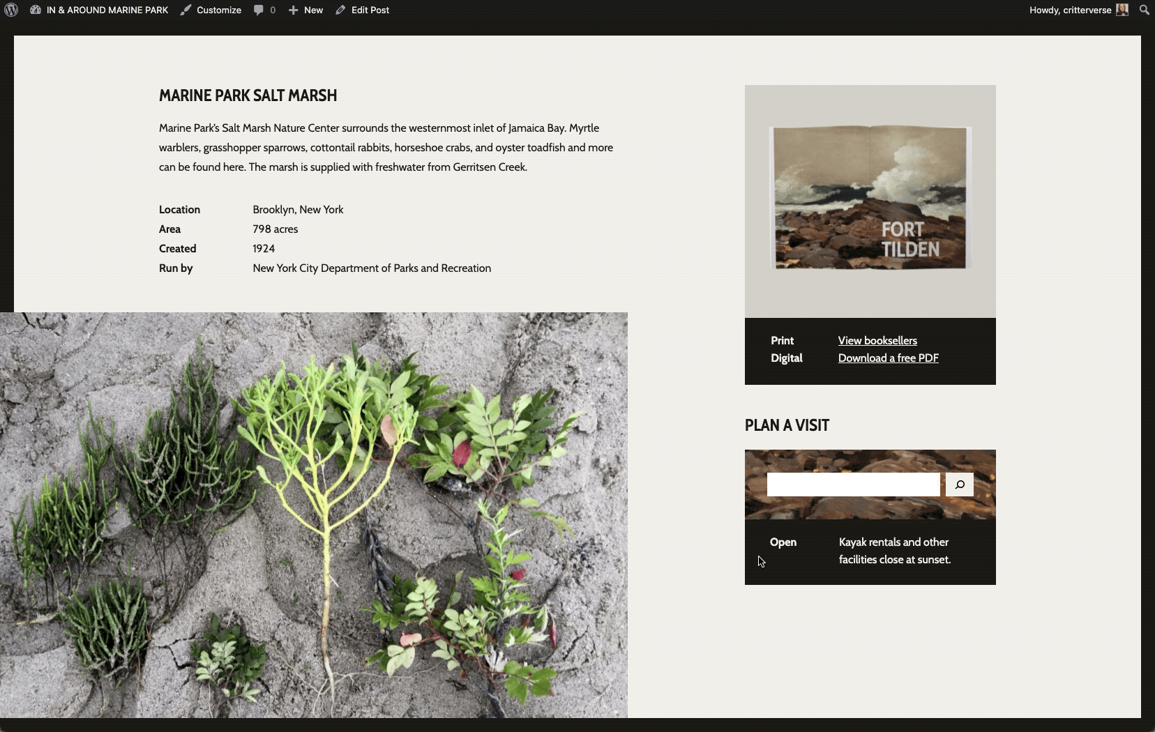
Container blocks like Cover and Columns make it really easy to weave dynamic or interactive elements into your designs. While dynamic/interactive elements are sort of a given for many types of widgets, the block versions of widgets can be easily wrapped and layered within container blocks to more fully integrate them into your layout.
In the example below, I tried placing a Search block in front of a Cover block, which creates a nice layered effect. I also tried inserting Custom HTML blocks within a Column block to display different messaging depending on the time of day. (jQuery script here)
Use traditional widget layouts (or not) with lots of flexibility over title and structure
Classic widgets have always had a lockup that includes a widget title. One cool thing about having blocks in widget areas is that you have complete flexibility over how titles appear. For example, you might choose to have a title over every widget, you might only want one title at the top of each widget area, or your design might not need titles at all.
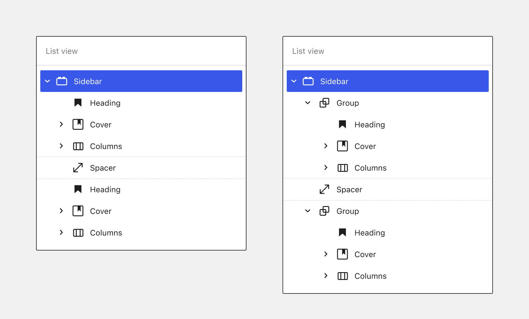
Note: Some themes, like Twenty Twenty-One, are designed to flow content horizontally within widget areas. If you’re having trouble with a theme splitting your layout into columns, you could try keeping the lockup together by containing it within a Group block.
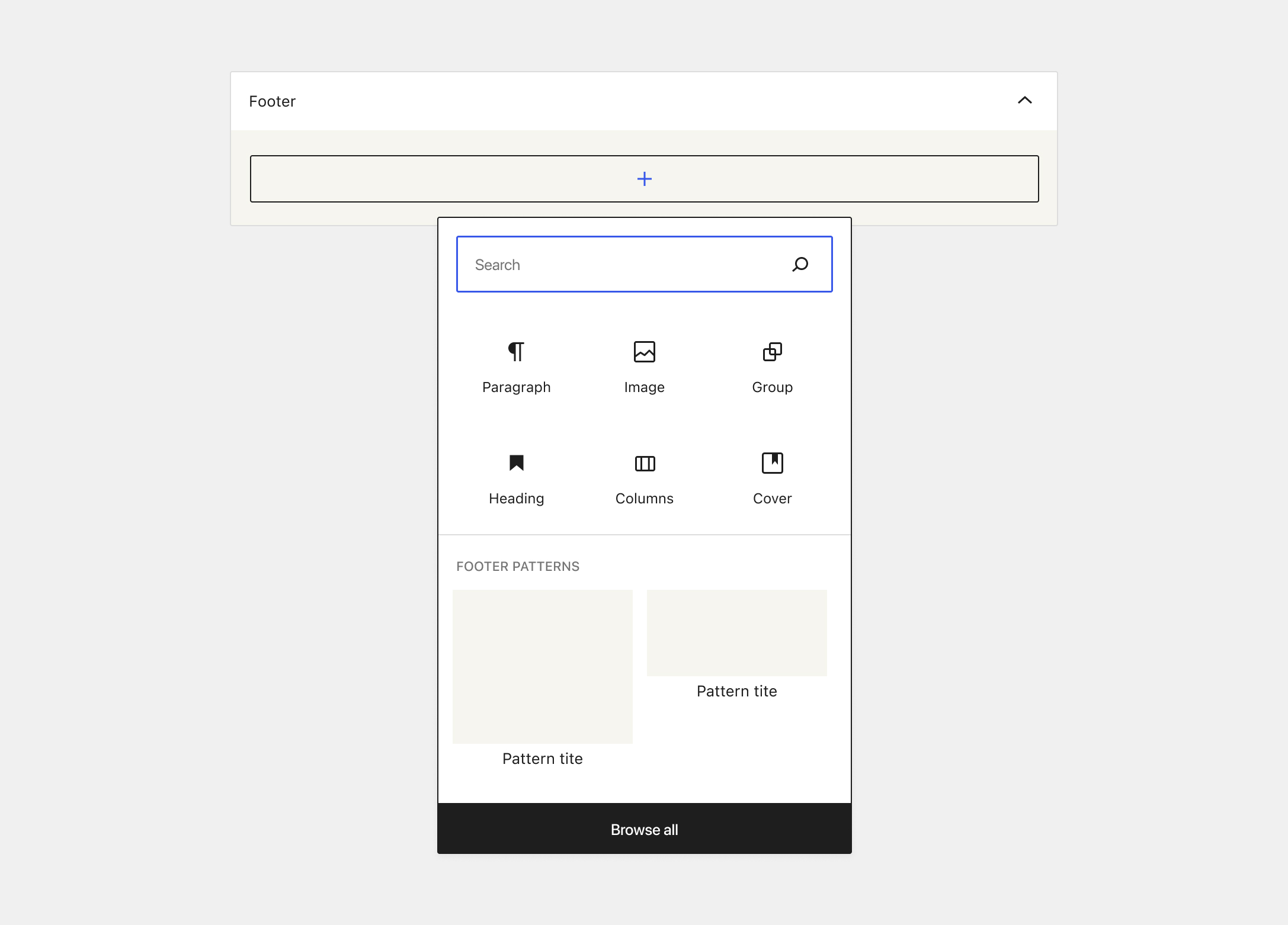
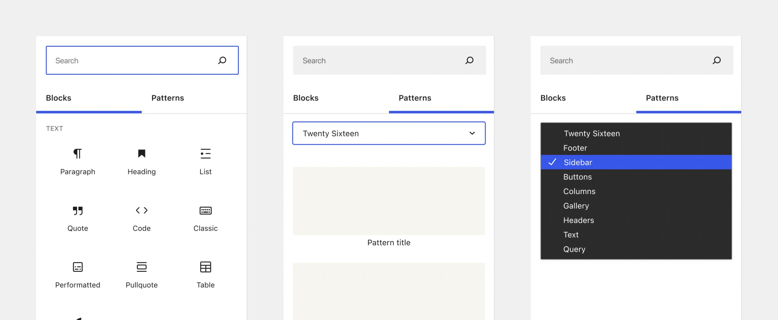
Copy & paste existing layouts from the WordPress Pattern Directory
While patterns haven’t been fully integrated into the widget editors yet, one thing you can do is copy and paste patterns from the game-changing new WordPress Pattern Directory into your site’s widget areas. I used this horizontal call to action pattern from the directory almost exactly as is, with minor color and copy adjustments:
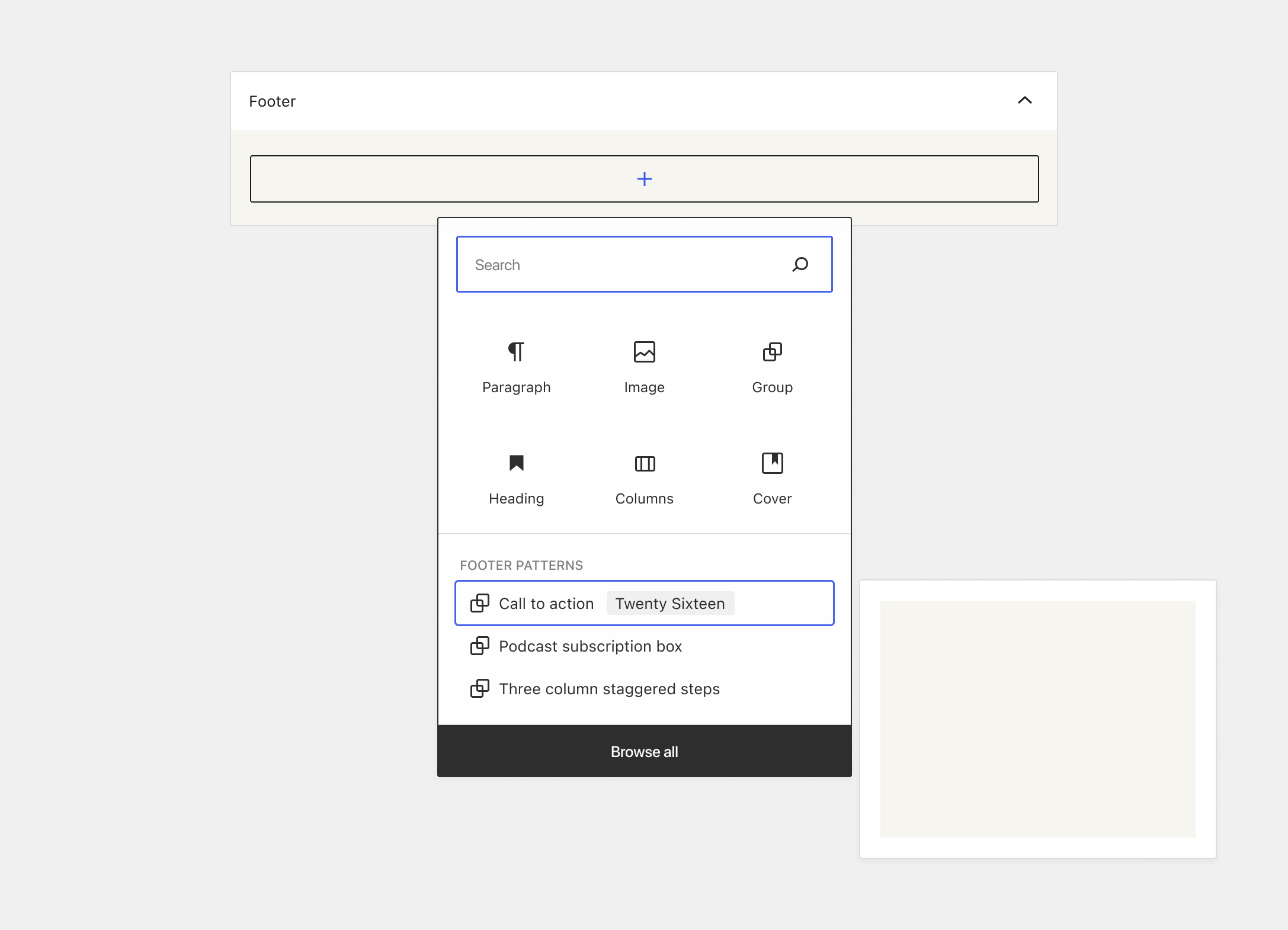
Inserting widget patterns
There is some early discussions about how patterns can begin to be integrated into the widget editors in GitHub issue #26170. Some of the conversation has been around introducing a Patterns tab into the inserter, which would allow users to browse patterns the same way as in the post editor.
A couple of goals for introducing pattern insertion UI into the widget editors are:
- Display patterns that make sense to use in a constrained sidebar or footer area, depending on the type of widget area being edited.
- Surface patterns in a extra discoverable way for users (including classic widget users who want to quickly recreate a traditional layout).
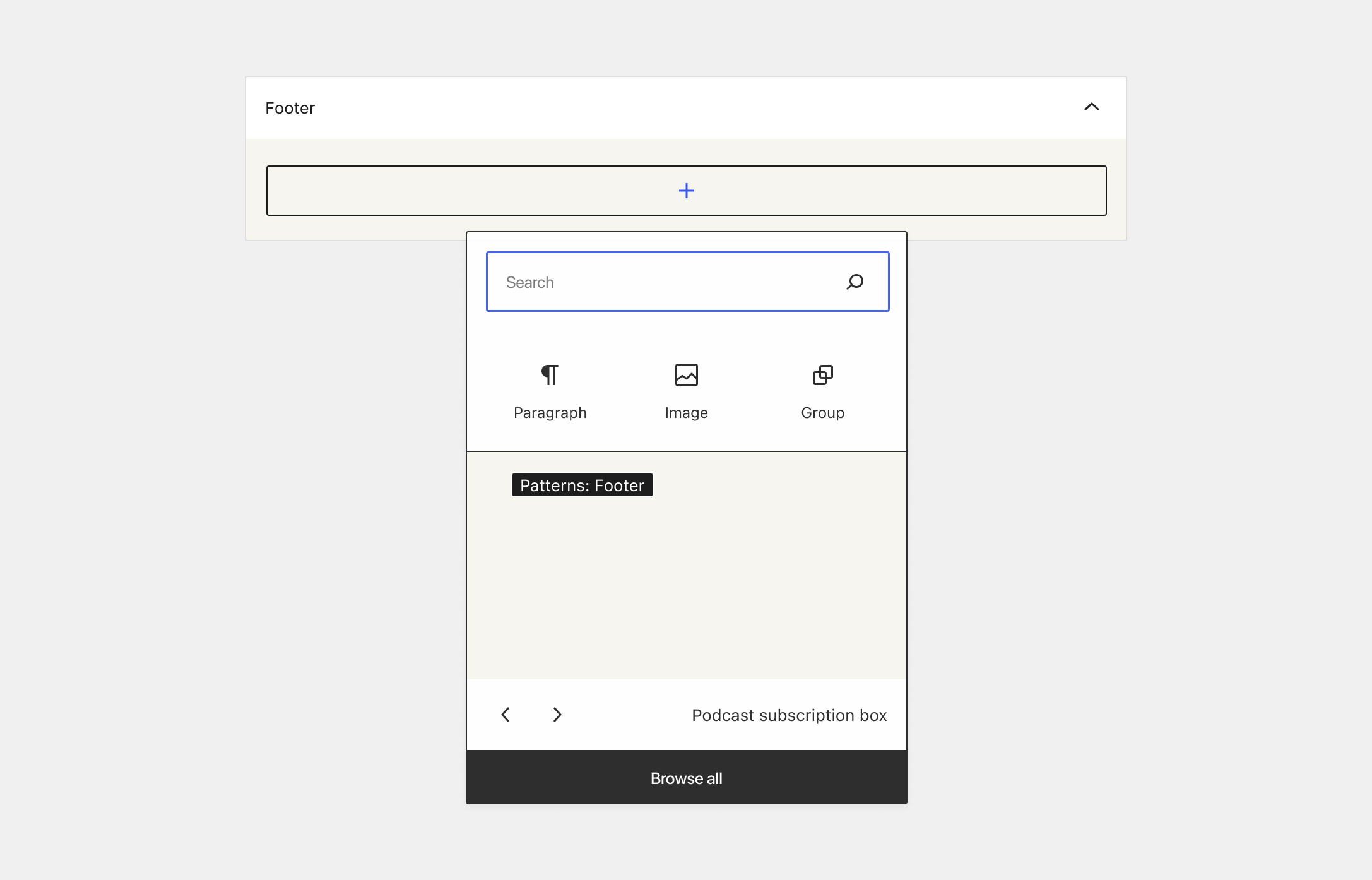
Based on this, I’ve been exploring ways that patterns could be surfaced in the quick inserter as a default/resting state as soon as the popover is opened: