For the better part of this year, I’ve been thinking on and off about saving global entities within other entities — specifically in the context of the Reusable block. More recently, I started trying to expand this logic to other entity blocks and to other contexts within the Gutenberg editors. Throughout the course of working on these explorations, some questions have come up around the nuances that make unsaved changes tricky to indicate in certain contexts, specifically in instances of nested blocks.
The more levels of nested blocks that are inside of a Reusable block (or Template part), the more levels a user has to navigate through in order to see the dot indicator on the outermost parent block toolbar. This question came up recently on GitHub:
Shouldn’t the case of changing nested blocks inside the Reusable block been handled somehow? If we add a
Groupwith a Paragraph inside the Reusable block and change that Paragraph, the block has edits but there is no indication for the changes.
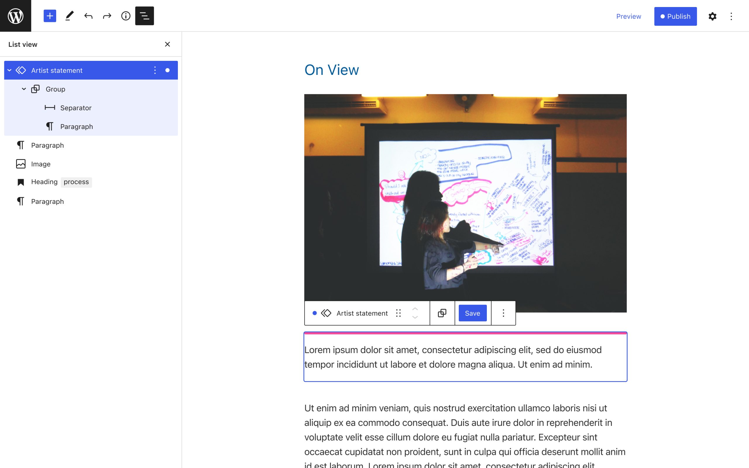
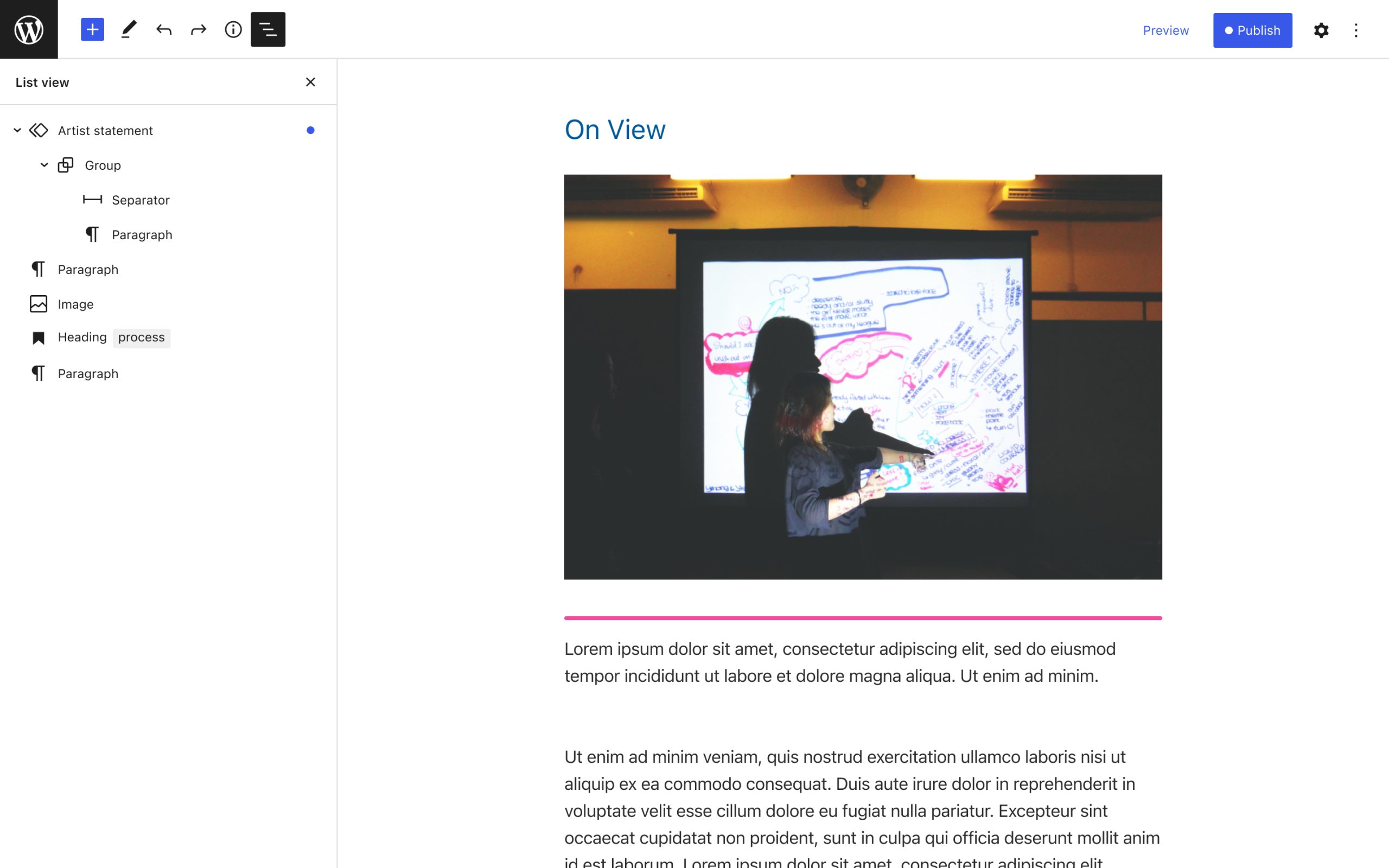
I’ve been wondering if introducing dot indicators into the List view could help further clarify where unsaved changes have been made.
In the example above, if a change was made to the inner Paragraph block, it wouldn’t be visible from the parent Group block. But it would be visible from the Reusable block toolbar and indicated next to the Reusable block in the List view.
Perhaps Save, Save As, and Discard functionality could be included in the existing ellipses flyout menu that’s accessible from the List view when there are unsaved changes.
Another tricky context is the one WordPress contributor James Koster outlines in this GitHub comment about edits made in the Template editor while editing a post:
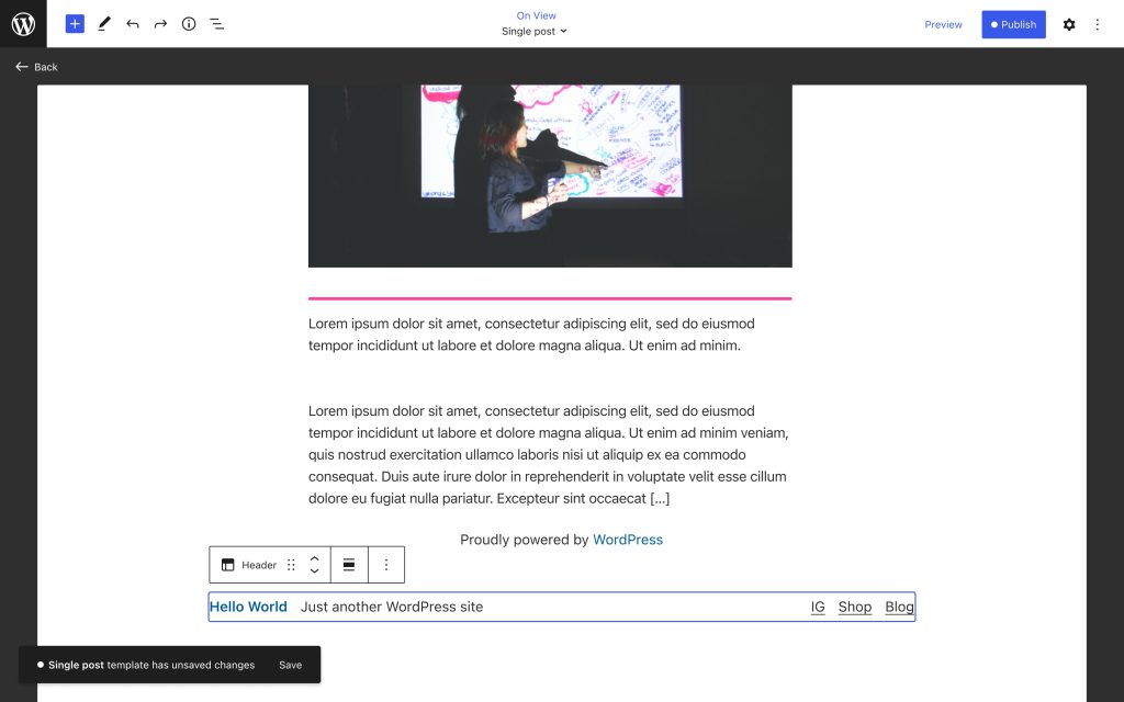
I’m editing a post [and] I edit the template by moving a Template part. In this case the Template part remains unchanged, but the underlying Template is modified. Since the Template has no toolbar of its own, we’d have to rely solely on the dot on the Save button alone. Is it adequate?
In this case, I think a snackbar could be a helpful way to help provide context for the dot that appears in the top bar Publish button, while also providing an opportunity to open the multi-entity saving panel directly from the temporary message:

So, say I made a major change to my Template like moving the Header to the bottom of the page for some reason — this change would trigger a snackbar with an “unsaved changes” message.
As always, I think there’s a fine balance to strike between an overwhelming feeling of having dots everywhere, and a smart use of dot indicators that help guide the user’s attention to changes that may have a bigger impact on their site than is always apparent while editing.

