FSE Outreach Program coordinator Anne McCarthy facilitated a recent call for responses (a slight change in format from the recurring FSE calls for testing) on the topic of block-theme switching, which officially kicked off the process of “thinking long term about what folks would want to be able to have across themes.” According to Anne’s follow up summary:
When it came to ideas for how to best manage the switching process, it quickly became clear that there’s a balance to strike between not adding too much friction to the process while also offering users options to pick and choose what can come with them when they switch.
The call for replies resulted in some imaginative descriptions of how this all could work. The responses also raise some important questions: what role should themes play in the world of block themes, especially when users may want to mix & match styles and layouts from different themes? What does switching themes mean in this context, when you might be able to use aspects from several different themes?
I used some of the responses to Anne’s post as a starting point for a blue-sky exploration around what theme switching might look like in a world of highly flexible themes that — in the true spirit of WordPress — can be hacked and cobbled together to your heart’s content.
Approach
The flows shown below stem from on an ongoing series of posts by Javier Arce and I that explore the possibility of introducing a Gutenberg-style mosaic interface across WordPress screens — including, for example, on the Appearance/Themes page. This is a thought experiment that we are excited to share more widely — please feel free to leave comments on the blog posts or message us directly in the Making WordPress Slack!
Idea 1
Redesign the current Live Preview theme switching flow to incorporate a process similar to multi-entity saving
Entry point: Appearance/Themes
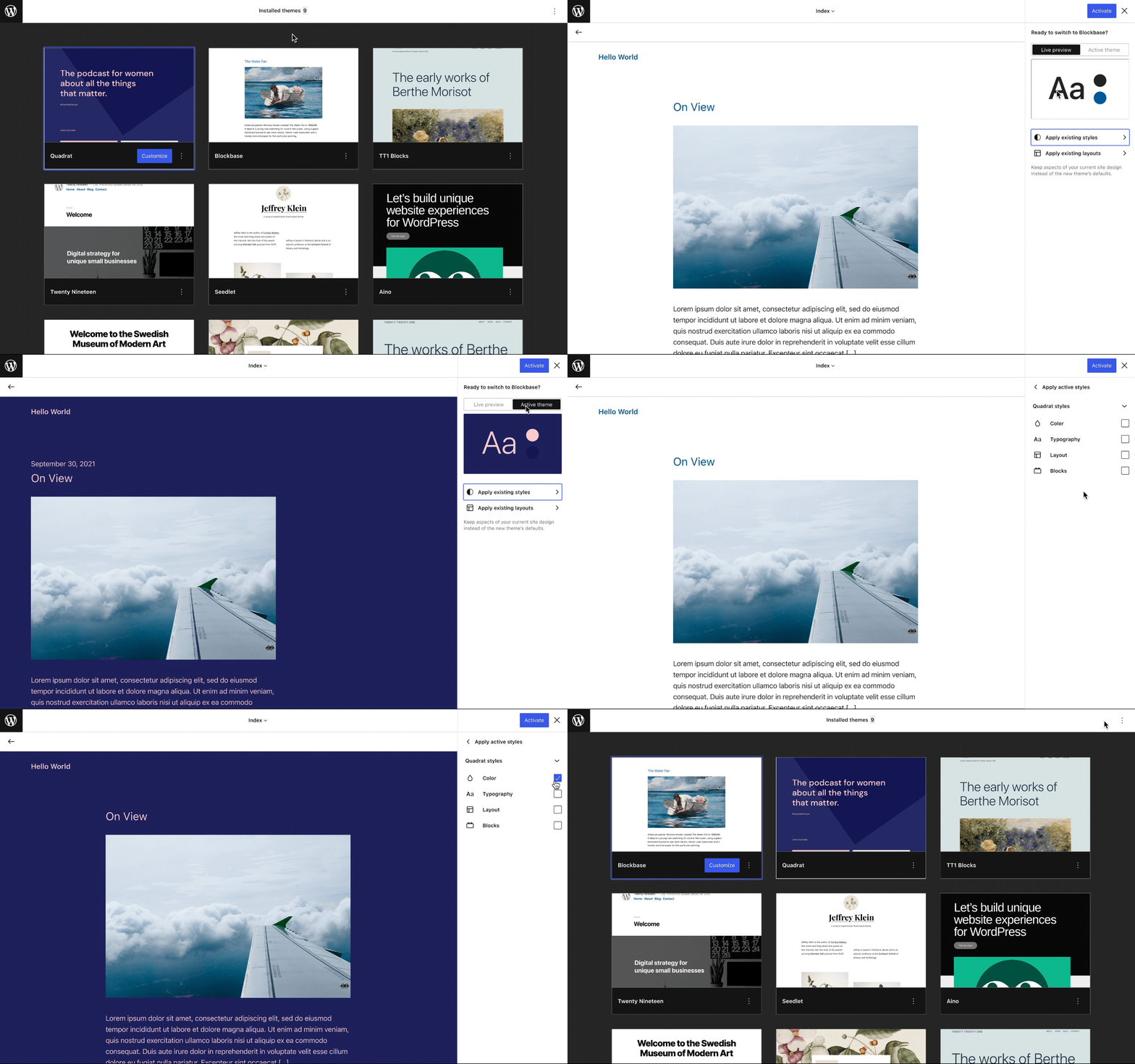
First, I explored the most literal translation of the current theme switching flow as it exists today while incorporating the top bar and other familiar Gutenberg components.
Just like the Live Preview functionality works now, we could utilize a Customizer-like preview that would allow users to preview and navigate the site before activating the changes. Selections regarding which styles and layouts to activate could be made in a sidebar panel, similar to the one used for multi-entity saving.
Like the current flow, the default behavior is a one-click activation that would switch styles and layouts to the new theme’s defaults (or to the user’s prior customizations of that theme’s templates, where applicable). This is based on the assumption that the majority of users will want to switch everything to the new theme’s look — but the activation panel also provides an opportunity to offer more granular selections.
We could utilize the thumbnail preview that appears within the Global Styles panel, and there could be a toggle allowing you to switch between the theme being previewed and the active theme on your site.
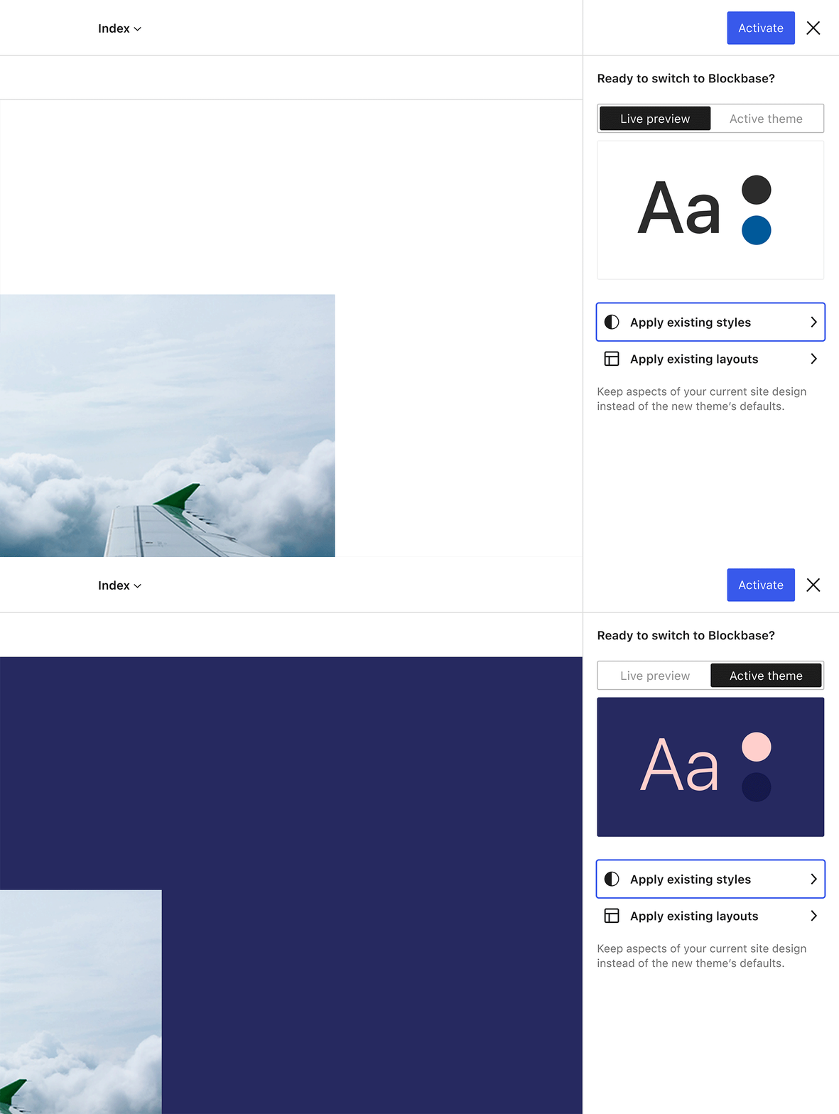
From there, it would be possible to drill down into more nuanced selections. For example, you might want to keep certain aspects of your active styles (e.g., just the color or typography) and have those be activated rather than the new theme’s defaults. Similar selections could be made for the layout by picking and choosing which Templates and Template parts to keep active on your site when switching.
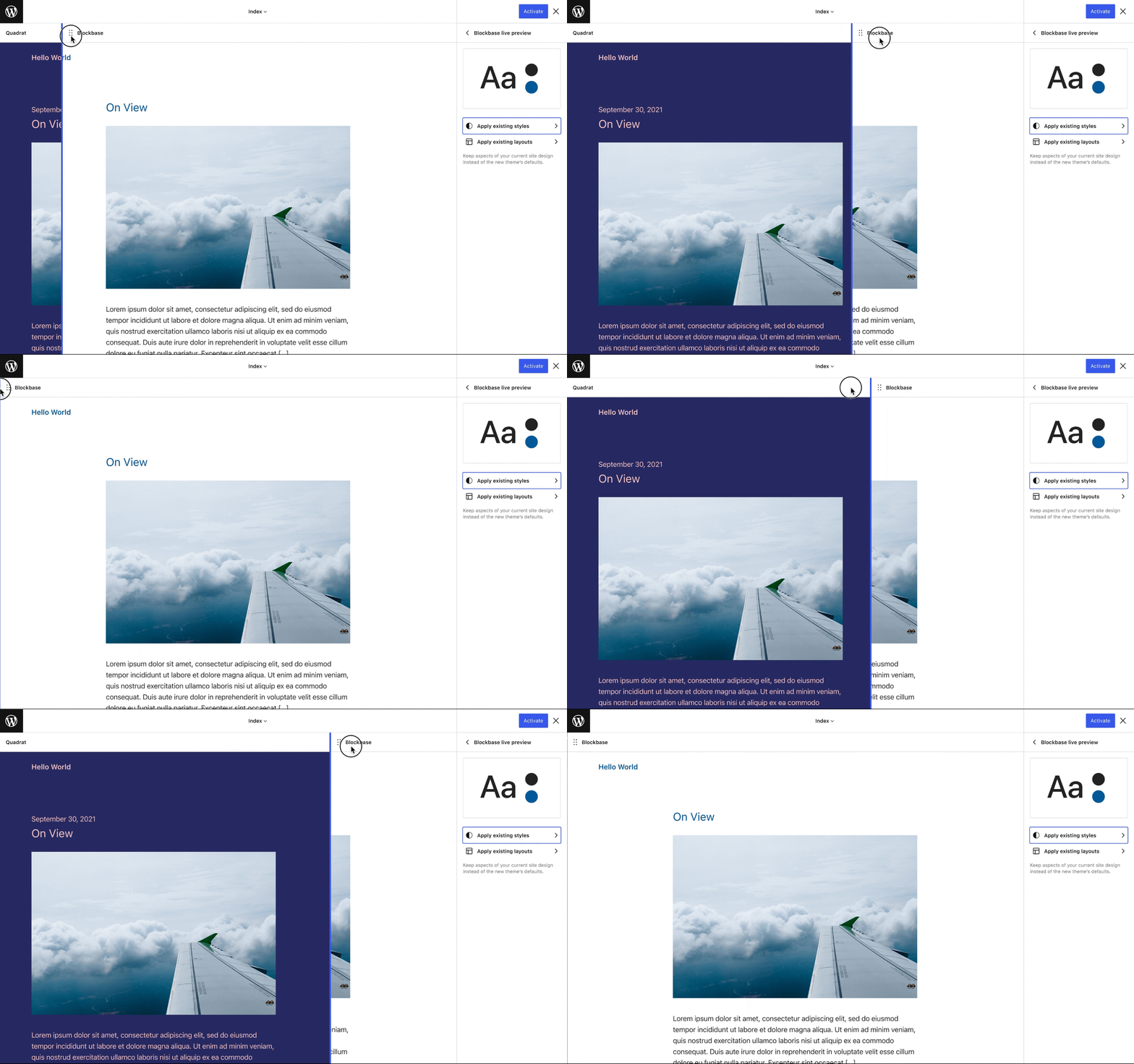
A fun variation on this idea is to utilize a slider for comparing the before and after layouts (similar to Jetpacks’s Image Compare block):
Idea 2
Make Theme management accessible directly from the Site Editor
Entry point: Global Styles panel
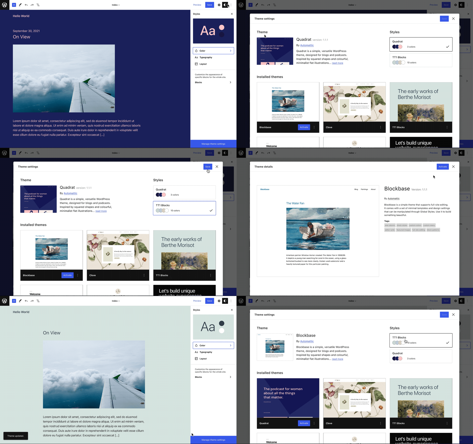
What if block-theme switching could be integrated directly within the site editing flow? For example, a modal containing the Appearance/Themes page could be directly accessible from the Global Styles sidebar. This would allow theme switching to happen more seamlessly without ever leaving the site editor, and hopefully turn the sometimes stressful moment of theme switching into something more akin to changing settings — it’s a low effort modal to close, reopen, and keep tinkering with.
Idea 3
Reconceptualize themes to emphasize styles (with optional or de-emphasized Templates)
Entry point: Global Styles panel
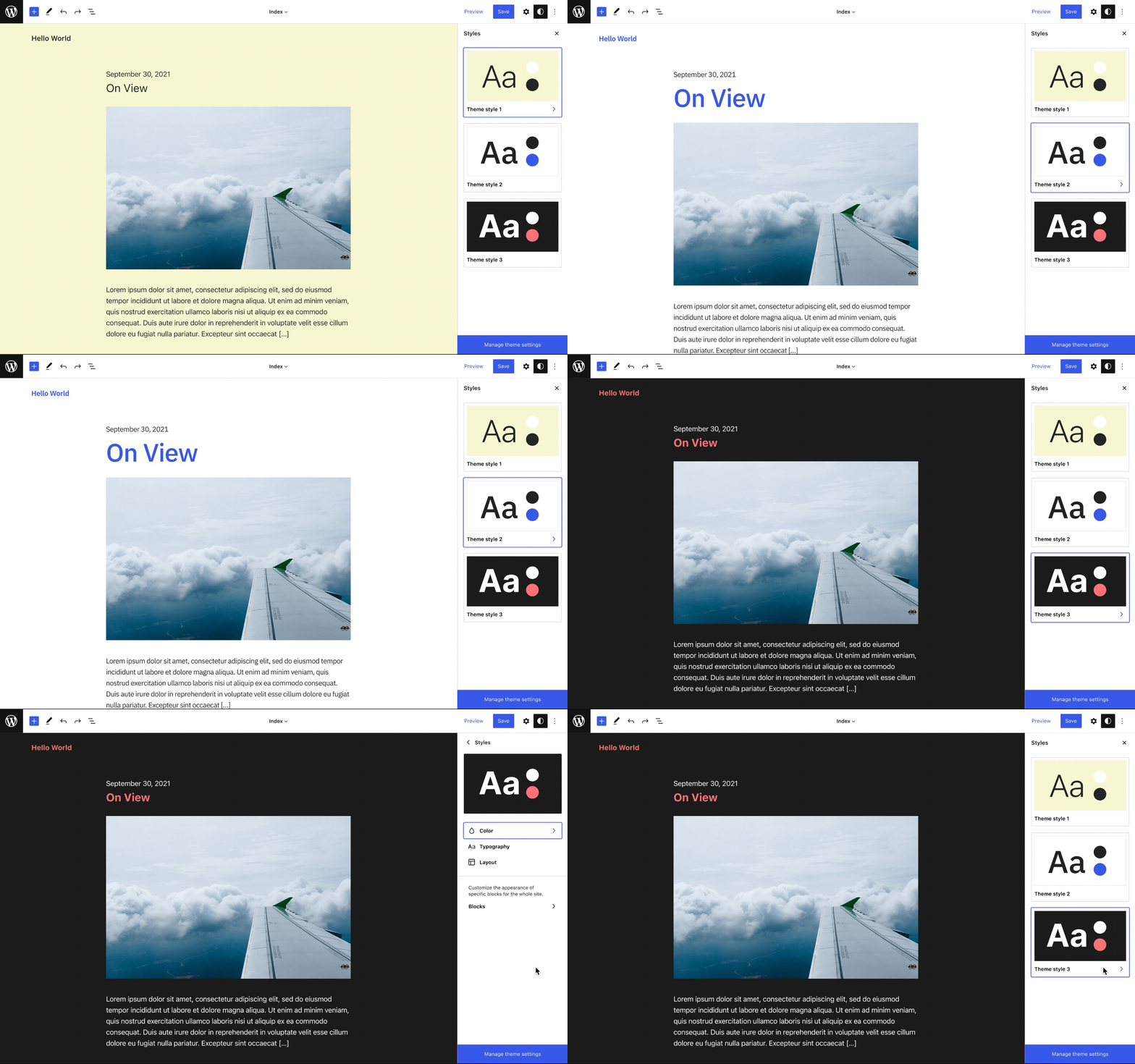
This last idea takes inspiration from a super interesting alternate range of color schemes shipping with the upcoming Twenty Twenty-Two theme. What if changing themes was about swapping styles, with template changes becoming something more seamlessly intertwined with existing editing flows? For example, maybe you could browse Template parts from other themes via the inserter or an in-canvas selector.
In this case, navigation between theme styles could happen directly from within the Global Styles panel. Utilizing the current Global Styles navigation pattern, perhaps you could drill down further to adjust and fine-tune after selecting a theme style.
What’s next?
While there’s a lot left unexplored in these flows, I hope these sketches can help serve as a starting point for design discussions around things we would like to see in the future of block-theme switching! A great next step would be to starting narrowing in on an iterative pathway towards enabling the mixing-and-matching of block themes — at the moment of the theme switch and potentially beyond.
One response to “Adventures in Block-Theme Switching”
[…] recently shared some blue sky ideas on the future of block-theme switching. This week, I wanted to come back down from the clouds to […]