An in-the-clouds exploration by Javier Arce and Channing Ritter ☁️
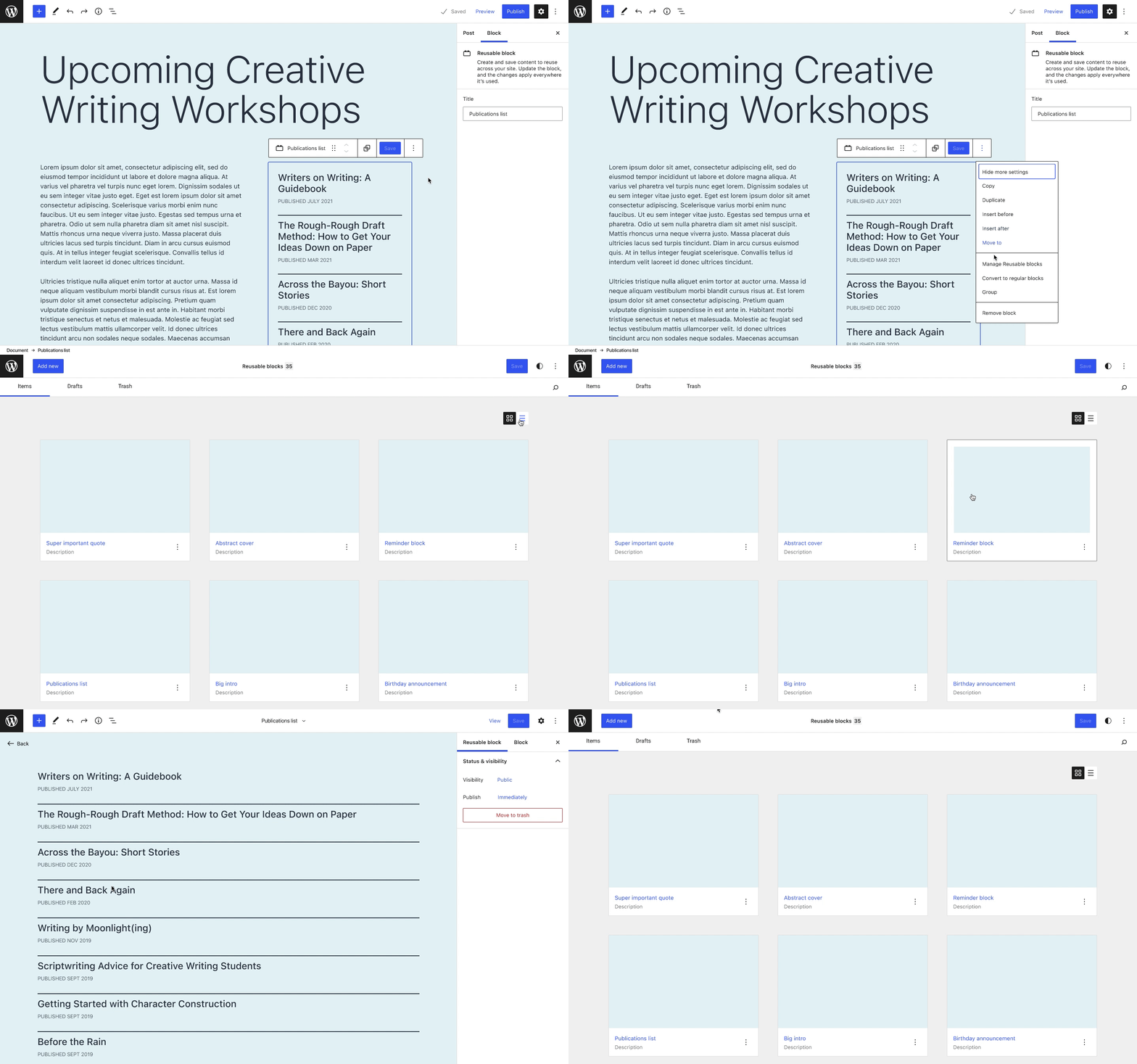
Building on the work of WordPress contributor James Koster and others who have been looking into how to implement a zoom-able mosaic editing view for Templates, we wanted to see if this format could be expanded to other post types. This exploration is loosely based on managing Reusable blocks.
In this post, we introduce an interface composed of two view modes (mosaic and table) that is very flexible, allowing users to manage different types of items and also highly extensible, allowing new features to be implemented on top of its basic structure. This management view could also be easily integrated with other systems, like the Global Styles sidebar.
Feel free to read on to learn about some of our design decisions, or skip to the end to try out an interactive prototype!
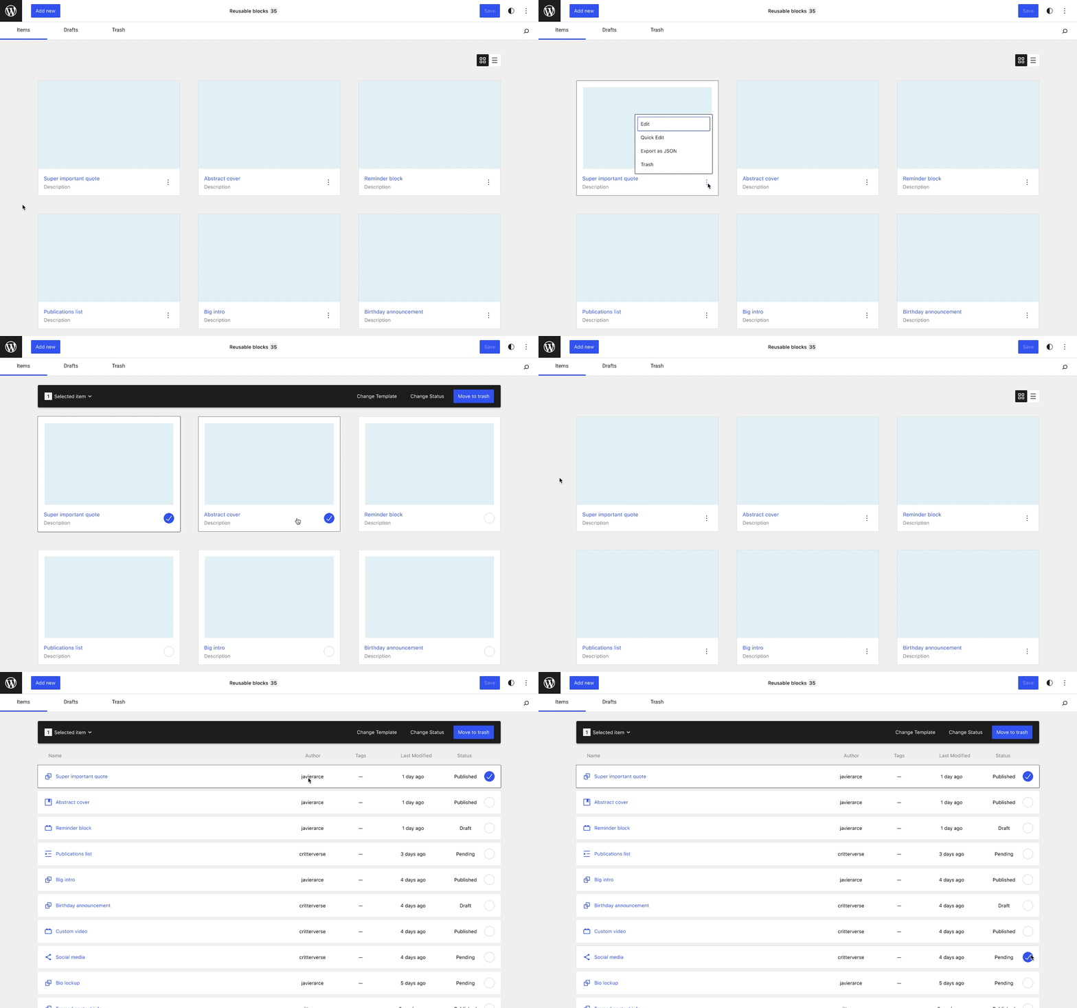
Add more flexibility over viewing options with a mosaic and table view
While mosaic view is all about large previews, a condensed table view adds a lot of value to the management of items: this view shows more items on the screen at once and allows for quickly scanning lots of information.
Bulk select by default, multiple ways to edit
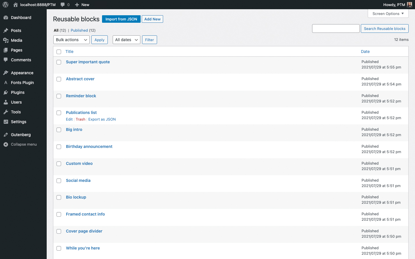
The current post type management screen has a checkbox for selection, a linked title that opens the editing view, and an explicit “Edit” link that appears on hover or when any items in the row are focused.
We’ve kept a few things from this interaction model, such as the linked title that opens an editing view. There are also several new ways to edit, like selecting the “Edit” option from the card ellipses menu or double-clicking on the card.
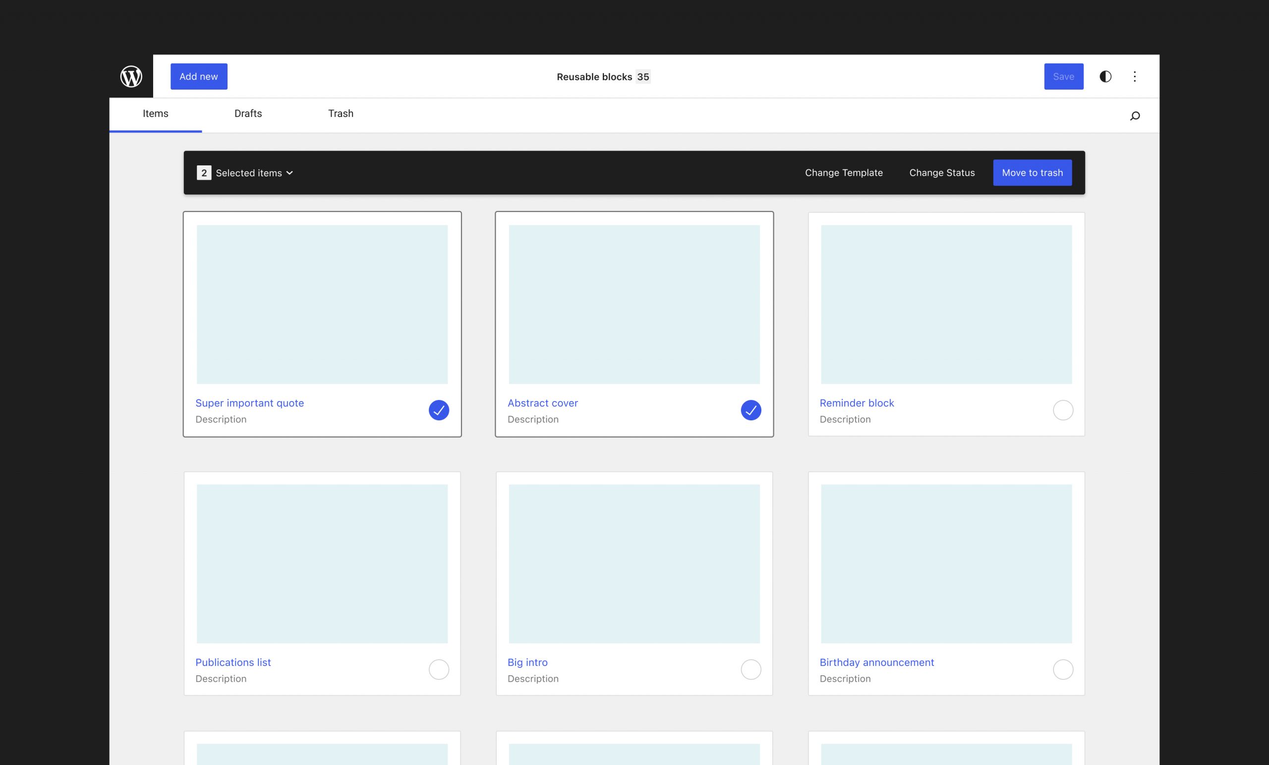
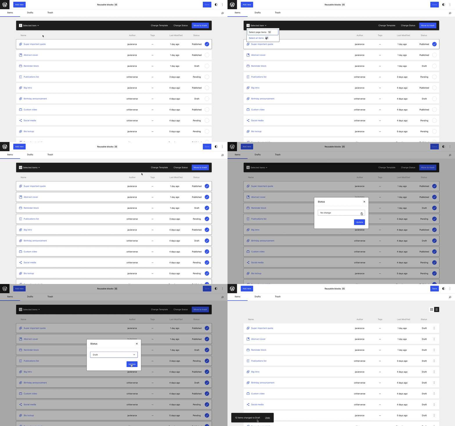
In terms of selection, we’ve explored a new pattern that potentially removes the need for a persistent checkbox. In this scenario, the first click on an item will activate a “selection mode” with several visual clues to help indicate the ability to bulk select:
- White frames appear around the card previews — this is a dramatic visual difference that’s hard to miss
- An unchecked circle replaces card ellipses menu — this is important usability-wise as the user can no longer perform the individual actions within the ellipses menu
- Bulk selection actions appear
- No double-click to edit
This is a big change from the existing interaction model, but we think it will be familiar to users as a common pattern used across web-based file management systems like Google Drive, Amazon Drive, and others.
Bulk actions that are only shown when relevant in a contextual bar
Having to select a bulk action from a dropdown menu and “Apply” it will be one of the things we’d be happiest to say goodbye to from the existing screen 👋. Instead, a contextual bar that only shows when relevant could contain secondary functionality like selecting (including across multiple pages) and bulk actions. These actions and other capabilities like Quick Edit functionality could take place inside modals. The global Save button in the top bar could use some more thinking re: which changes would trigger it and whether it’s needed.
A streamlined interaction mode for engaging with Global Styles
In one of our earlier prototypes, we shared an idea around how opening the Global Styles sidebar might force the view to switch from table to mosaic view in order to ensure that any styling changes take place next to a visual preview. Since then, we’ve also started looking into how zoom functionality could also be incorporated into this concept.
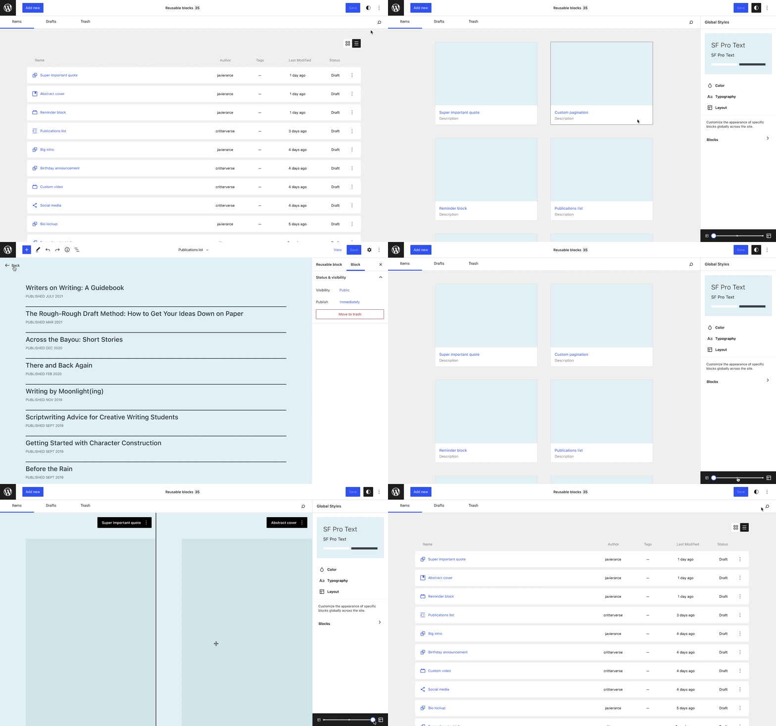
In the above prototype, opening Global Styles activates a new interaction mode:
- Enforced mosaic view (hides toggles UI)
- Zoom functionality is available from within the GS sidebar
- No selection / bulk editing
- No card ellipses menu for applying individual actions
- One click to edit while previews are contained in cards
- When previews are expanded further, the cursor can become a move cursor (other actions could potentially be available from the ellipses menu)
There are still a lot of open questions around interacting with Global Styles from the mosaic view — a big one being whether this makes sense for post types other than Templates.
Code Prototypes
- Switching between mosaic and table views
- Using Tabs and Pagination
- Selecting items from the toolbar: visible items or all the items in the table/mosaic
- Selecting items with the keyboard and mouse: one or many (using
shift+click or⌘+a) - Deselecting items (with the
Esckey) - Trashing: individual action (card ellipses menu) and bulk action (contextual actions bar)
- Snackbar notifications
- Hover previews over thumbnail icons
- Keyboard navigation (using the arrows to move around and the spacebar to select items)
Looking ahead
In the future, perhaps a unified file management system could help guide users throughout the WordPress CMS:
3 responses to “Post Type Mangement”
[…] Javier Arce. This exploration is an extension of some of our recent work around wp-admin’s Post Type Management screens […]
[…] series of posts by Javier Arce and I that explore the possibility of introducing a Gutenberg-style mosaic interface across WordPress screens — including, for example, on the Appearance/Themes page. This is a thought experiment that we are […]
[…] to add richness rather than shortcodes, custom HTML etc. https://wordpress.org/gutenberg/-style mosaic interface across WordPress screens — including, for example, on the Appearance/Themes page. This is a thought experiment that we […]