Drag and drop is known for being one of the most intuitive interaction patterns there is. One behavior that users might expect to find in Gutenberg is the ability to create side-by-side images by dragging and dropping an image next to an existing one.
Note: This behavior has previously been explored in GitHub issue #13202 and perhaps elsewhere!
The Current Behavior
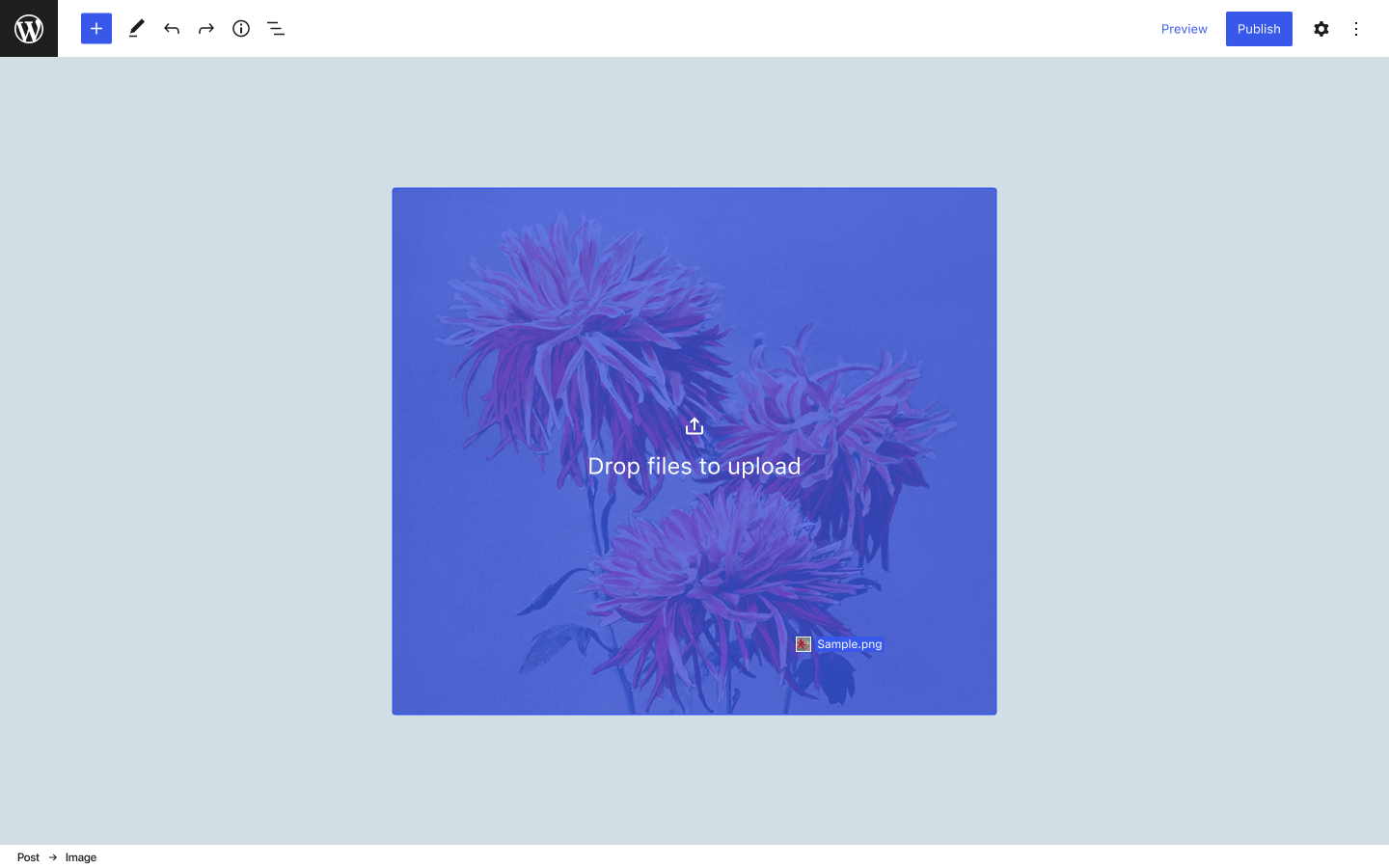
Right now in Gutenberg, you can drag an image on top of an existing Image block, which will upload the new image and replace the current one. The drop zone covers the full area of the block and is indicated by a blue overlay color with a CTA.
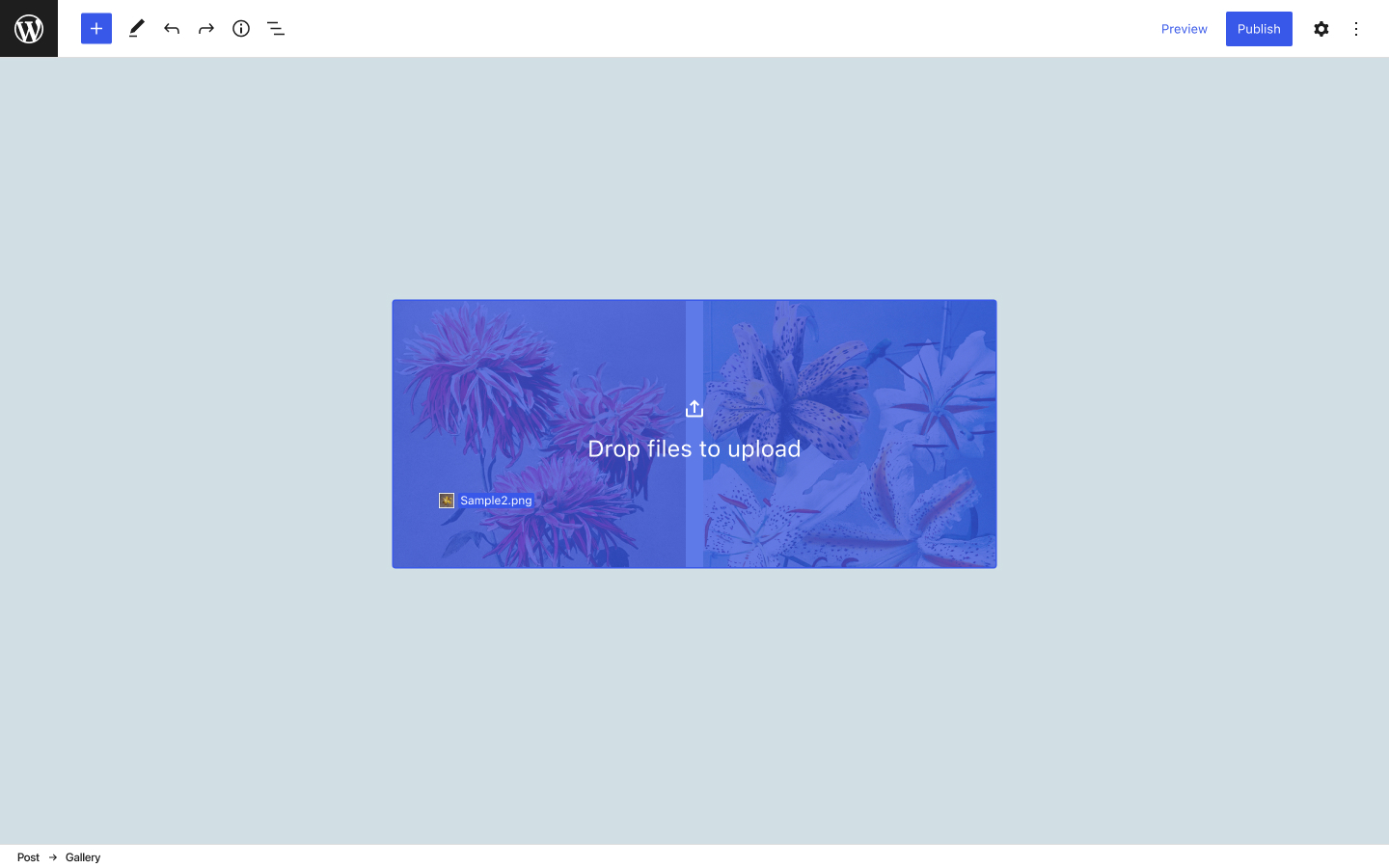
The drop zone looks exactly the same on the Gallery block, covering the full area of the block, but the behavior is slightly different there. Instead of replacing, the new image is added to the gallery.
The current overlay behavior works great for each of these singular interactions. The key design challenge is finding a way to offer both options so that a user can replace an image or add another image within a single drag motion.
Transforming an Image block into a Gallery block
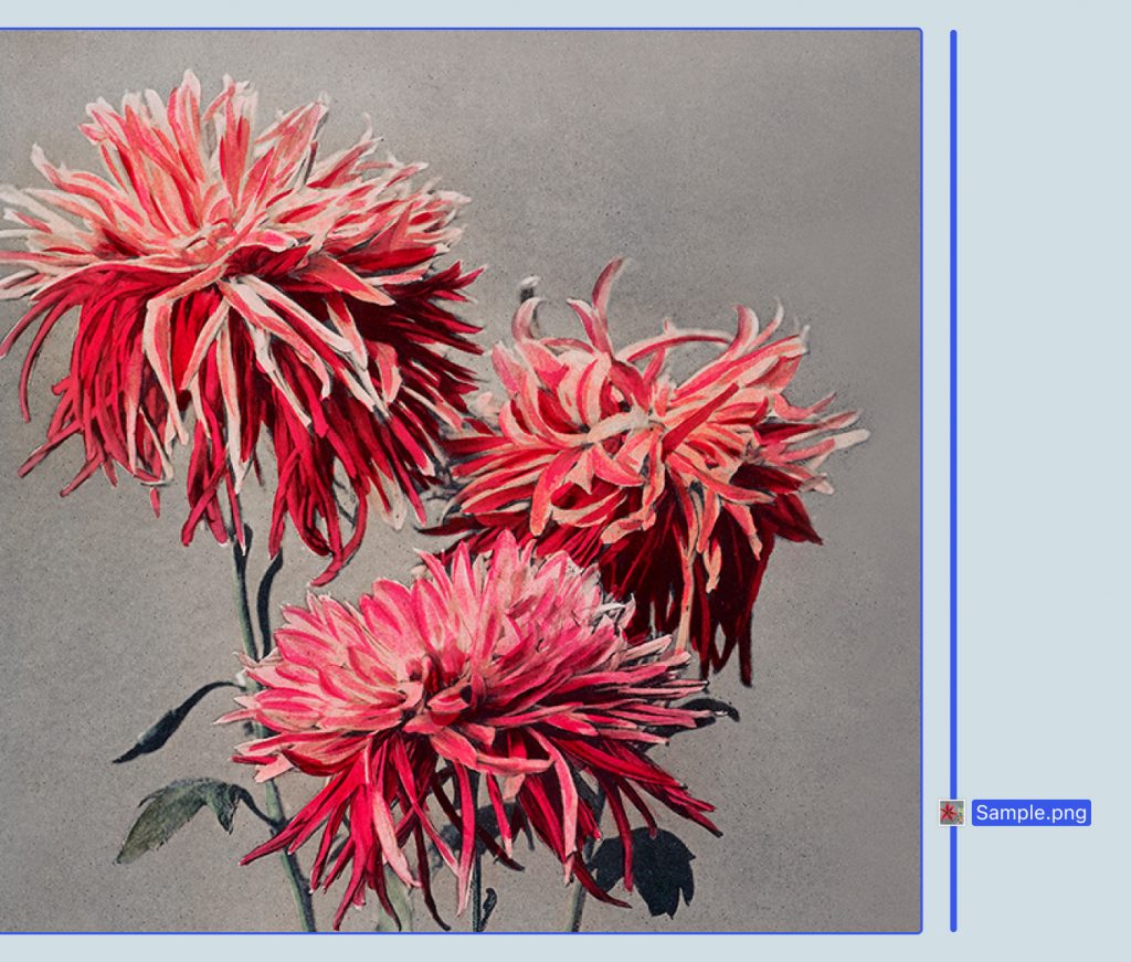
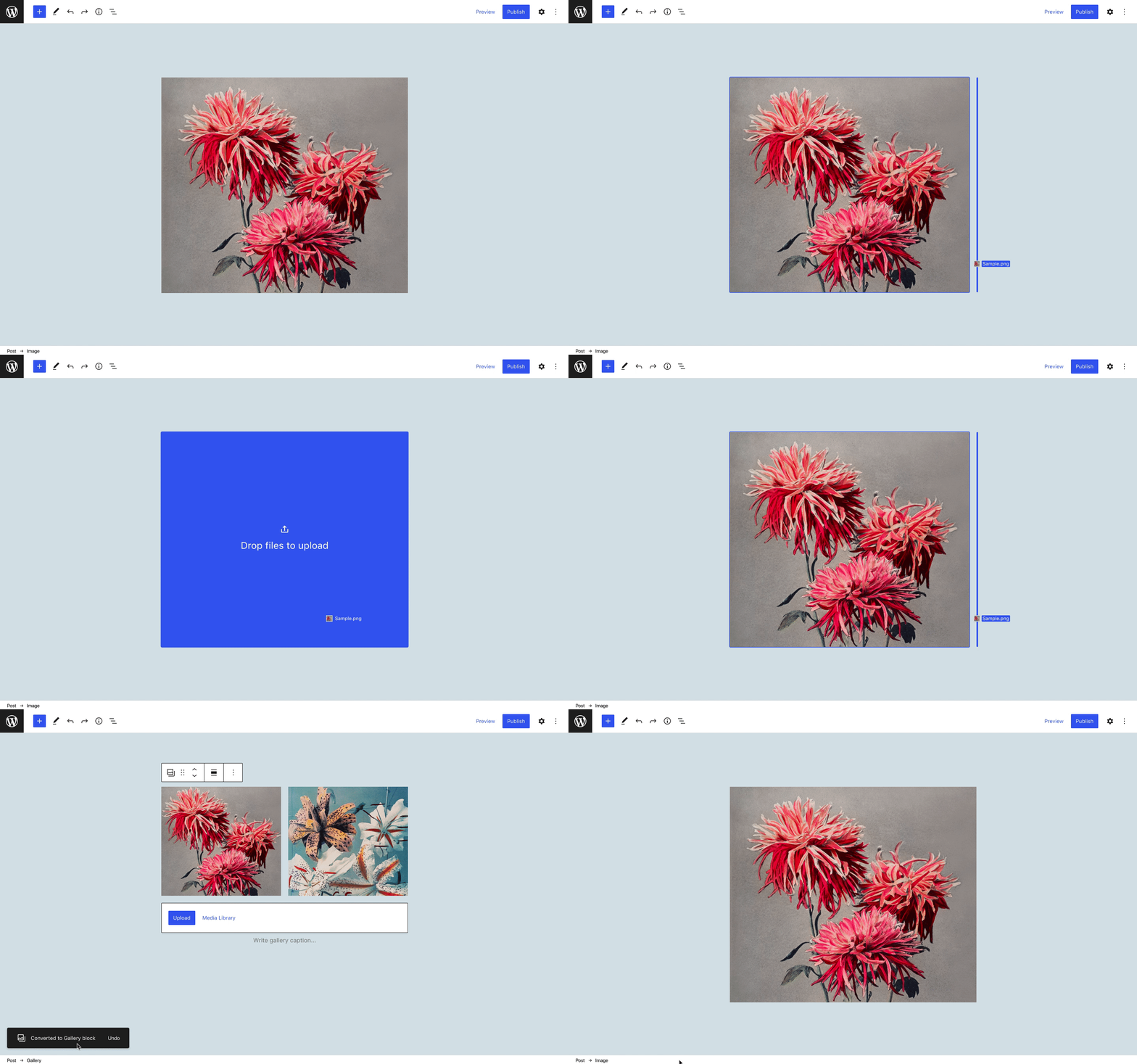
The blue overlay color could be reserved for replacing an image, with a new treatment introduced for transforming the Image block into a Gallery block to achieve a side-by-side effect. I used a 4px vertical line to indicate the position of the new image — this is the same visual treatment used for the “move to” indicator (but I can also see a conceptual argument for using a 1px line like the sibling inserter).

We could show a snack bar after the user completes the transform via drag and drop, as it’s not explicitly clear that this action will change the block type. A snack bar offers the opportunity to undo the transform, and could also be a way to call more attention to the new block type through the use of a block icon.
Adding and replacing images in the Gallery block
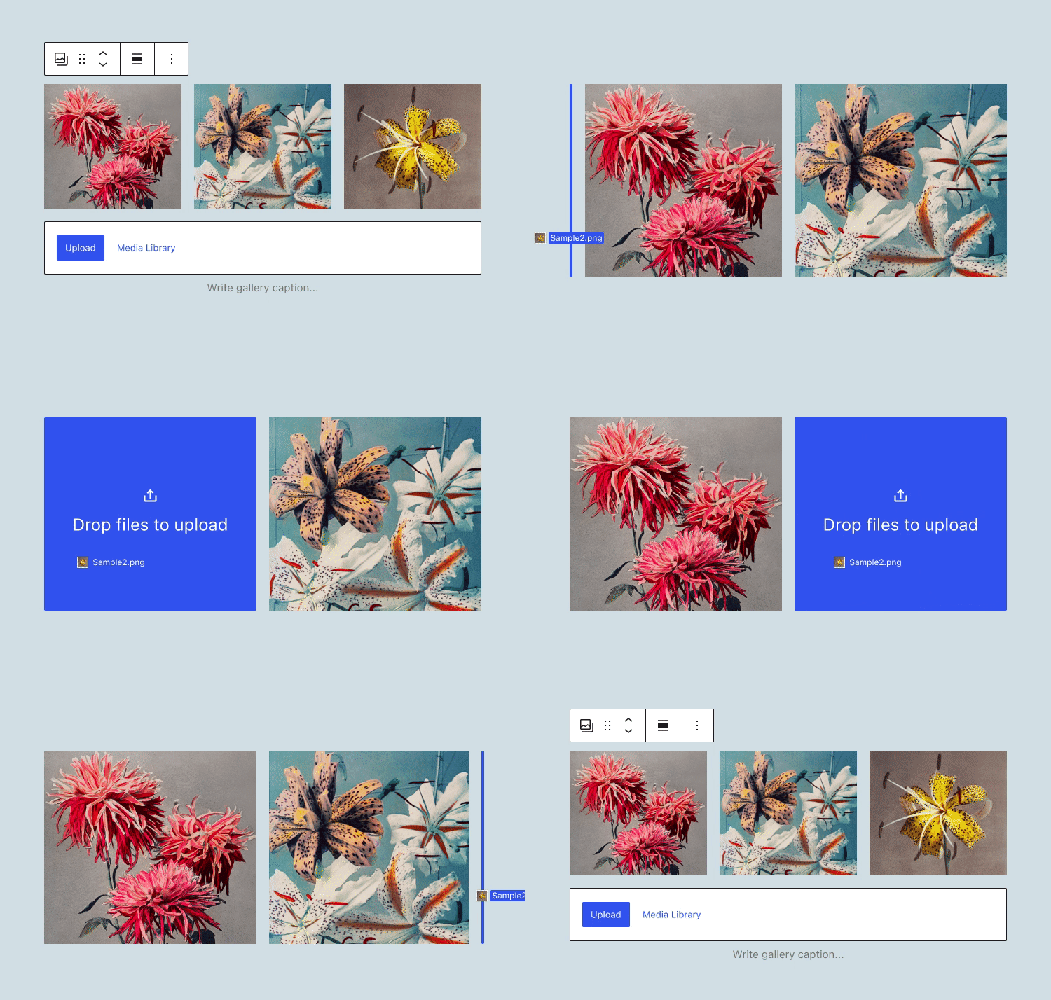
It would be nice to extend the same behavior to the Gallery block so that a user can seamlessly go from one image to two images, and from two images to three images, using the exact same interaction pattern. This could be a part of larger efforts to unify the Image block and Gallery block more closely.
Implementation
I imagine this could work by identifying separate drag zones within the area of the existing image for replacing/transforming but it would be helpful to play around with this in a PR to see what feels right!
Another option that would introduce slightly more friction to this interaction would be for the transform-related drop zones to only “unlock” after a long hover over the area. In this scenario, a quick drag and drop would always default to an image replacement with a longer hover opening up additional options (but I think the simpler interaction described above is closer to the expected behavior).
