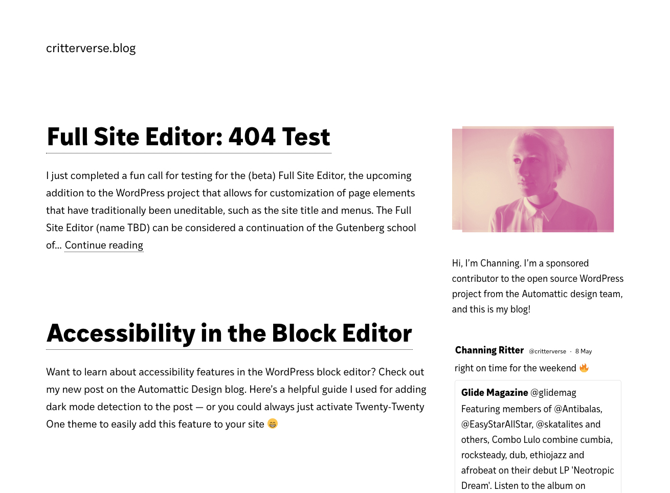
With WordPress 5.8 coming soon, there’s a new call for testing to try out the up-and-coming block-based Widgets Editor. This is an exciting update because it brings the power of highly customizable blocks to widgets areas, whereas classic widgets could be pretty limiting in terms of styling options.
I decided to use the Customizer Widgets editor to create a new sidebar for the homepage of this blog. It’s not recommended to use beta features like this on a live site but I’m choosing to live dangerously in this case!
I started by adding a third-party widget from the classic screen called “Custom Twitter Feeds” (and a few other core legacy widgets that I edited out later on). Then I published, and activated the Gutenberg plugin to try adding some blocks. The biggest difference right off the bat was that the Twitter feed was displayed as a WYSIWYG preview by default, rather than a form — which is an exciting evolution from the classic Widgets editor.
I added an Image block and changed the colors using the amazing new duotone feature. One thing to note is that the experience of customizing blocks can be a bit frustrating right now without the Undo/Redo functionality that exists in the post editor, but the good news is that this addition is currently in the works.
Next, I added a Paragraph block with some “about me” text. It’s a really lovely change to be able to style the text exactly how you’d like now that all of the Paragraph block settings are available.
I published again and switched over to the Appearance Widgets editor to try making some changes there as well. It’s a little confusing when you first come into the screen because it doesn’t automatically open to the widget area that’s in use — but overall, my blocks and widgets were working as expected.
You can view my fancy new sidebar on the blog homepage ✨
Here’s a list of some bugs and other small issues I saw along the way. I’ve crossed referenced with GitHub to avoid duplicating known issues, and opened some new tickets where needed.
General comments & open questions:
- Do alignment options make sense in the context of widget areas, or should they be limited somehow? For example, it feels weird that you can add a Cover block and set it to “full width” or “wide width” even though those options are not typically available within a sidebar or footer.
- The “change widget” action that appears within legacy widget toolbars feels like it might be unnecessary. Fellow WordPress core contributor Shaun Andrews touches on this issue in a recent blog post about his experience testing the Appearance Widgets editor.
GitHub issues:
One response to “Welcome to Block Widgets”
[…] Welcome to Block Widgets […]