Hello world, welcome to my new design blog ✨ I’ll be sharing ideas and work-in-progress here as a sponsored contributor to the open source WordPress project from the Automattic design team.
My first blog post is a continuation of work I shared previously on the GitHub Repository for the Gutenberg project. Like the previous iteration, this proposal is focused on improvements for background controls in the Cover block and other container blocks like Column and Group. The goal is to make elemental background controls like color and media positioning accessible at the block level, while making new types of media available for use.
The three main elements of this design proposal are:
Placeholder block menu
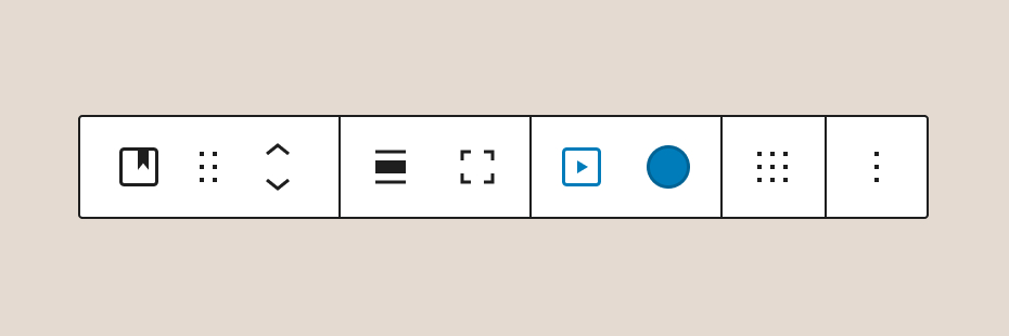
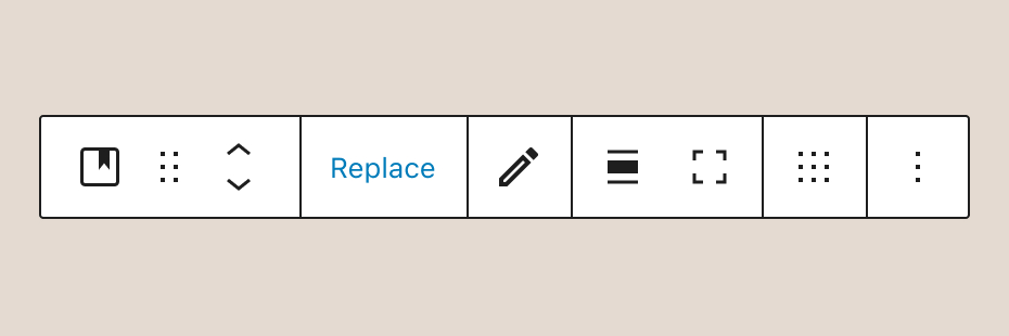
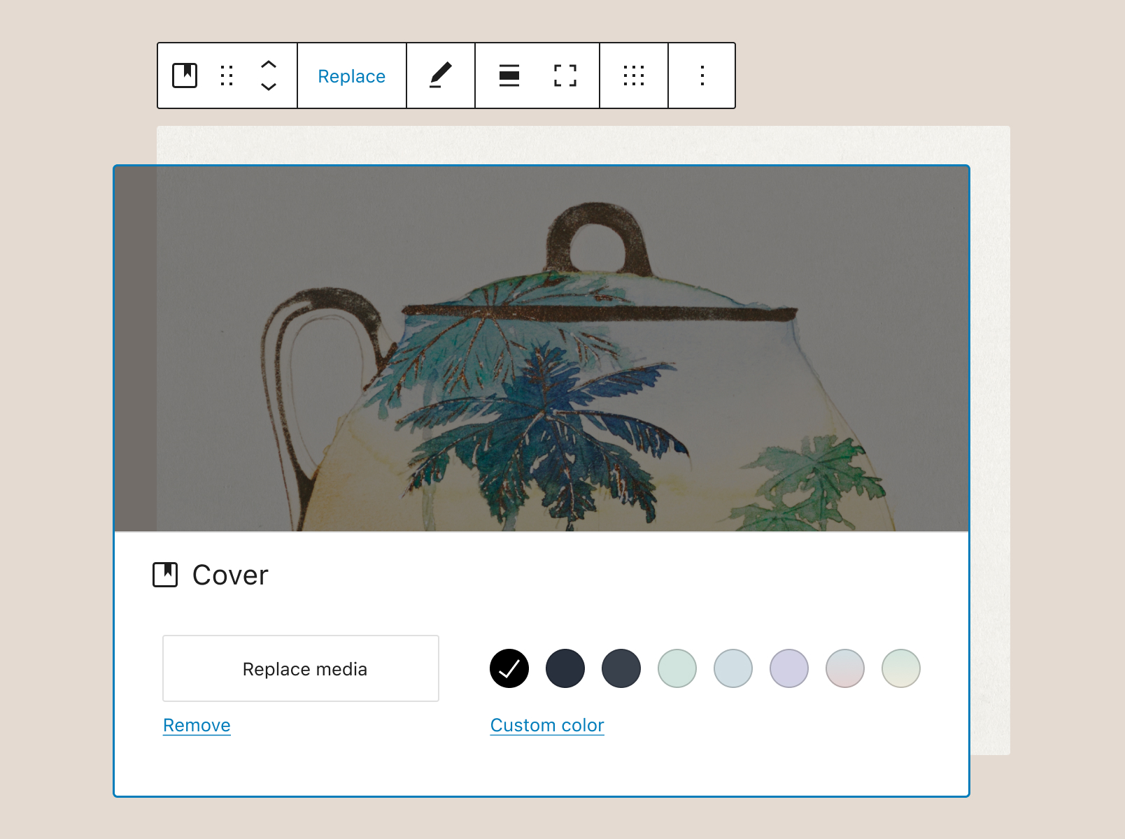
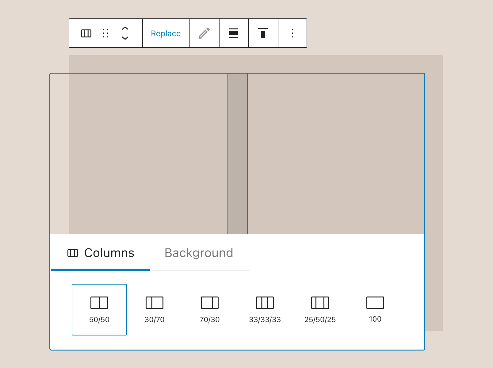
Unlike the previous iteration, the options for Media Settings and Overlay Color are now combined into a single item in the toolbar, with the “Replace” action re-appearing the placeholder block as a menu. The idea is that the UI (and code) for the placeholder block — which already contains options for both media and color — can be repurposed for both block setup and block editing.
Taking a cue from the recent work of WordPress contributor James Koster, I explored a more WYSIWYG design of the current placeholder block:
Edit Background mode
Matías Ventura, lead architect of the Gutenberg project, shared an interesting idea last year in the GitHub repo: an “Edit Background” tool that would allow users to reposition and resize background media within a Cover block. The flow is similar to the way cropping tools work for an Image block, with the editing tools temporarily taking over the block toolbar until the changes are applied.
Editing background
“Editing background” is the default mode for the Edit toolbar, turning the cursor into a move handle and allowing media to be repositioned within the frame of the Cover block. Crop handles give the user the ability to resize the viewport for the image.
From an accessibility standpoint, it’s really important to make sure this works just as smoothly using a keyboard/screenreader. I’m wondering if something like this could work as a potential editing sequence:
- Select “Edit Background” from the Cover block toolbar
- Shift focus to the image/media
- Use arrow keys to move media within the frame of block
- Use a modifier key to shift focus to crop handles
- Once selected, use arrow keys to position a crop handle
Enterto return focus to the Edit toolbar
Focal point
A second tab in the Edit toolbar is for setting a focal point for the background media. The focal point can be set using a keyboard to highlight a specific portion of the image.
Display
There are three actions available from the Display popover menu: Fill, Fit, and Tile. Media added to a Cover block is set to Fill by default, but that setting will be overwritten if the user resizes the image viewport using the crop handles. In that case, the Fill or Fit actions can be used to reframe the image in the new viewport window.
Background panel
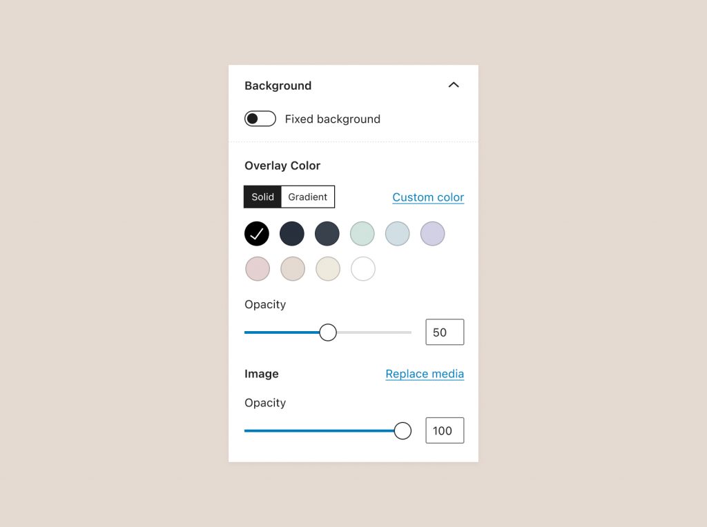
In the Block Inspector for the Cover block, a single Background panel could replace the two existing panels for Media Settings and Overlay Color. This design stacks Overlay Color settings above the Media settings to reflect the positioning one might expect from a control panel that supports layers, with the full opacity image in the background and the 50% opacity overlay in the foreground.
What’s next?
I’m also looking into ways to introduce a new “size to fit media” action in the Cover block toolbar, which could potentially be grouped with the “toggle full height” action. This needs more thinking but might work since they are both handy shortcuts for quickly changing the block dimensions.